Andrew Robinson
Az írás története
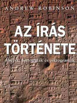
Az írás az egyik legjelentősebb találmány az emberiség történetében. Nélküle nem létezne a mai fogalmaink szerinti történelem és civilizáció. De hogyan, mikor és hol fejlődött ki az írás? S napjainkban vajon a jelek és szimbólumok „egyetemes nyelve” felé tartunk? Andrew Robinson tömör és alapos szövegében elmagyarázza, mi az összefüggés hang, jelkép és írás között. Ezt követően bemutatja az összes jelentősebb írásrendszert az ékírástól az egyiptomi és maja hieroglifákon át egészen az ábécékig, valamint Kína és Japán írásrendszeréig, de szót ejt olyan jelenségekről is, mint a cseroki „ábécé” vagy a rúnaírás.
Rendelés
David Jury
Mi az a tipográfia
A nyelv elsődleges kommunikációs eszközünk mind írott, mind beszélt formában. Bár használatát többnyire természetesnek vesszük, számos tényező befolyásolhatja hatékonyságát. A Mi az a tipográfia? az írott kommunikáció olyan megszokáson alapuló formáit, illetve ezek változatait vizsgálja, amelyek biztosítják az információ minél tökéletesebb közvetítését. Emellett megismerhetjük azokat a módszereket, amelyekkel a tipográfusok – valamint a nyelvészek, pszichológusok, filozófusok és információtervezők – szakterületüket tanulmányozzák, és a kapott eredményeket alkalmazzák.
Rendelés
Robert Bringhurst
The Elements of Typographic Style
Na ez nem igazán a betűtervezésről szóló könyv. Sokkal inkább egy fantasztikus és inspiráló bevezető könyv a tipográfia világába érdekesebbnél érdekesebb hivatkozással és történeti kapcsolattal. Teljesen új ablakokat nyit. (SV)
Rendelés
Sofie Beier
Reading Letters: Designing for Legibility
This book will, on the one hand, help type designers create high legibility typefaces and, on the other hand, help graphic designers determine which is the optimal typeface for a given project. A must-have for type designers and graphic designers.
Rendelés
Sofie Beier
Type Tricks: Your Personal Guide to Type Design
Type Tricks is about typographical rules and the underlying structure of the work process in the design of new typefaces. In that way, it is both a reference book and a user manual. In an illustrative format, it presents the different stages of type design in an easily accessible manner.
Rendelés
Fred Smeijers
Counterpunch: making type in the sixteenth century, designing typefaces now
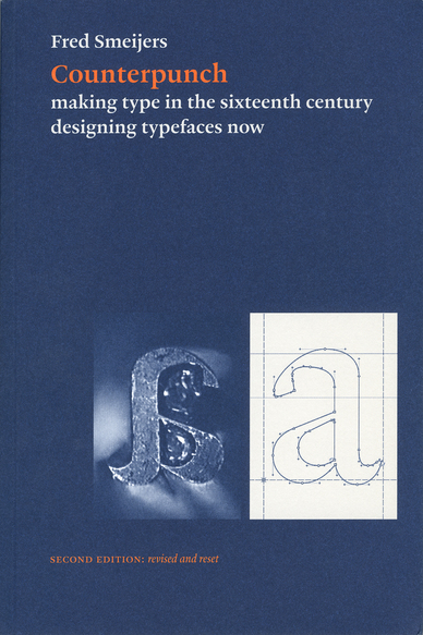
Counterpunch is packed with ideas. It is both an investigation into the technics of making metal type by hand, and a consideration of present questions in type design. The discussion takes in the fundamentals of designing and making letters, so that the book can be read as a guide to type and font construction in any medium. Lively, pointed drawings and photographs complement an equally fresh text.
Rendelés
Cristóbal Henestrosa / Laura Mesegeur / José Scaglione
How to create Typefaces
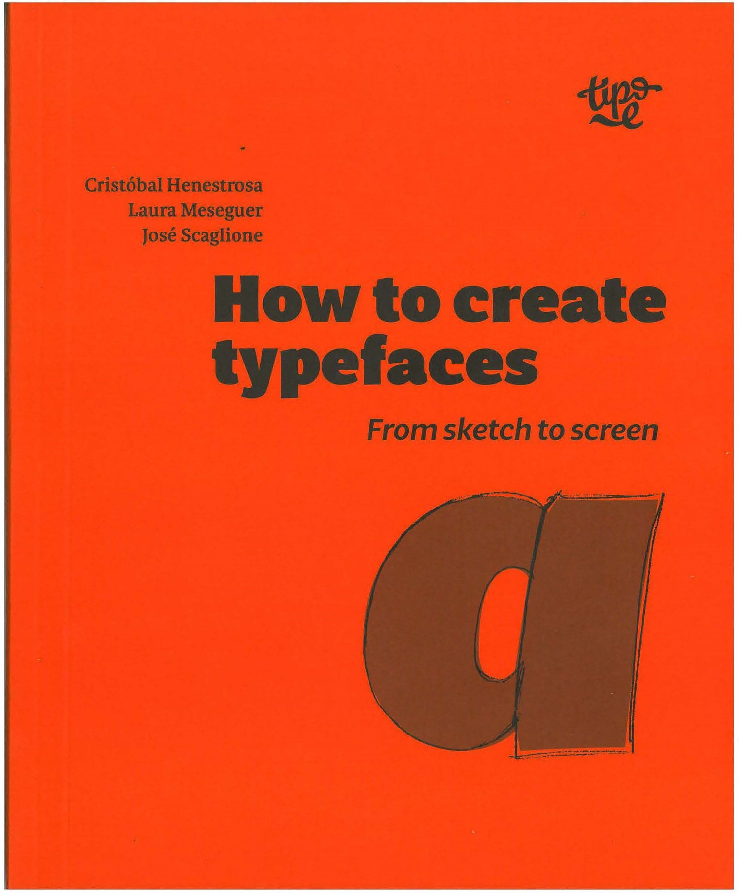
How are typefaces designed? Which characters are essential? What is the difference between roman, italic and cursive? What is OpenType? In "How to create typefaces" Cristobal Henestrosa, Laura Meseguer and Jose Scaglione answer these and many other questions in a straightforward and direct way.
This publication, aimed at new and novice type designers as well as those trained in the field, unravels the fascinating task of creating a font, from sketch to screen.
Rendelés
Karen Cheng
designing type
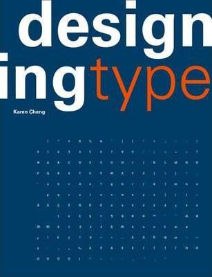
Ez a könyv a címével ellentétben nem igazán a betűtervezés technikájáról szól, hanem sokkal inkább az abc betű karakterek részleteinek a sokféleségét mutatja be.
Szinte teljesen végig illusztrált könyv a klasszikus betűcsaládoktól kezdve a kortárs, mai modern betűkig. A könyvben egy-egy betű jellegzetességei vannak bemutatva egy oldalon több betűcsaládon keresztül bemutatva. (SV)
Rendelés
Gerrit Noordzij
The Stroke
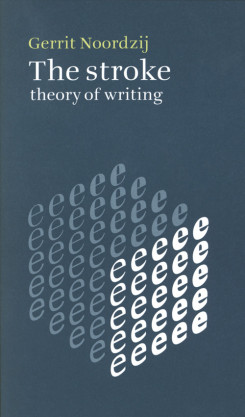
Originally published in Dutch in 1985, this is 2019 English-language edition of the theory of writing by the teacher and type designer Gerrit Noordzij who directed the course at the Royal Academy of Arts in The Hague from 1970 to 1990. Noordzij’s short and analytical text, illustrated with his own diagrams and examples, presents a genuine theory of writing done with any tool and clarifies the relationship between the written and typographic letters.
The books starts with basic concepts of forms and space around forms, and explains in details technique an quality of writing. Thee idea are applicable not only to calligraphy but to all available technology including the digital media.
Rendelés
Walter Tracy
Letters of Credit
The revolution in typesetting - a revolution that over the past two decades has eliminated a five-hundred-year-old system of hot metal production and replaced it with one of photo-generated and computer-driven composition - shows no sign of winding down. This book, more than any other we know, traces the steps that went into that revolution and simultaneously makes the argument that the letter forms themselves are in process of evolution. Tracy argues that, whether they are of the sixteenth or the twentieth century, the forms that comprise our alphabet are subject to the same rules of good taste, proportion, and clarity that have always obtained.
Rendelés
Toulouse Letters:
Teaching Experiments In Letter Drawing
Following a series of invitations made since 2005 in the field of type design at the Institut Supérieur des Arts de Toulouse, this book retraces the collective experiments undertaken in the Graphic Design option through workshops, exhibitions, lectures, semester courses, and projects in partnership with the City of Toulouse. By way of interviews and essays proposed by the different guest type designers (Alejandro Lo Celso, Frederik Berlaen, Thomas Huot-Marchand, Hans-Jürg Hunziker) and the teacher coordinating this programme (François Chastanet), its subject is about sharing different pedagogical approaches to drawing letterforms at the beginning of the 21st century.
Rendelés
Gerard Unger:
While You're Reading
This book is about everything that happens while you're reading – in front of your eyes and inside your head – and about what type designers, typographers and graphic designers bring to a page to make reading happen. Thanks to Gerard Unger we get another look at the way people behave – and it's this understanding of human behavior that arms the graphic designer with the tools necessary to conceive, produce and deliver compelling messages. This book ranks high on the list of must-read books for anyone who deals with developing and designing texts for readers.
Rendelés
Alexander Lawson:
Anatomy of a Typeface
The book is notable for devoting entire chapters to the development and uses of individual or small groupings of typefaces. Beyond Anatomy of a Typeface Lawson has considered and discussed the classification of types. Within Anatomy, Lawson arranges the typefaces by classification. In his preface, Lawson qualifies his classification: "After using this system in the teaching of typography over a thirty-year period, I know that it is reasonably effective in the initial study of printing types. I am not disposed to consider it faultless by any means. A classification system, after all, is simply a tool ... Its primary purpose is to help people become familiar with these forms preparatory to putting them to effective and constructive typographic use.
Rendelés
Jan Middendorp:
Shaping Text: Type, Typography and the Reader
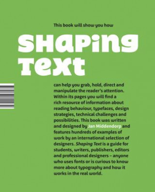
Shaping Text takes a practical and broad approach to typography. It is aimed at design students and graphic designers, and also at those who are concerned with content: writers, editors, and publishers. Showing a wide range of examples from first-rate designers across the world, the book examines why and how typographic designs work well in a given context. Particular attention is given to the team play between the text itself—written language—and the design—the shaping of the text—to form a new, multilevel visual message with a complex content.
Rendelés
Tim Ahrens and Shoko Mugikura:
Size-specific adjustments to type designs
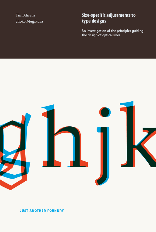
The aim of this book is to determine principles underlying the design of optical sizes, with a view to giving useful advice to practitioners who wish to design such sizes for their own fonts.
“Optical sizes” are size-specific adjustments to type designs. They were practiced for 500 years of metal type printing. Since punches had to be cut separately for each type size, adjusting them accordingly did not involve any additional effort and the optical compensations were built into the fonts. Characters intended for use in small sizes typically show an increased width and x-height, reduced stroke contrast and looser spacing. In phototype, size-specific adjustments were largely given up and single-master designs dominated. This practice was continued during the early years of digital type.
Rendelés
Roxane Jubert:
Typography and Graphic Design: From Antiquity to the Present
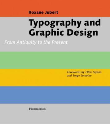
This chronological study traces the evolution of graphic form, from Antiquity through the Middle Ages and up through the age of technology. Each period is explained in detail, from Classical craftsmanship to the changes brought on by the Industrial Revolution and the modern-day potential of the digital world. As computers now play an integral role in academic and professional environments, virtually everyone makes font choices on a regular basis, rendering typography more relevant than ever before. This thorough, scholarly, and visually-appealing volume combines the history of the letter form from the invention of printing to the relationship between graphics and totalitarian regimes with intricate analysis of graphic design and typography, all supported by 850 images with extensive notes and a bibliography. This is an indispensable handbook for understanding our daily visual environment, and essential reading for all graphic arts professionals."
Rendelés
Edward M. Catich:
The Origin of the Serif: Brush Writing and Roman Letters
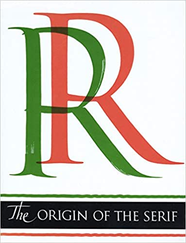
This handsomely illustrated book goes beyond a discussion of the serif. Here you will find a new approach to the history, lineage, and development of our alphabet, a detailed explanation of letter cutting in stone, the manner in which the brush differs from all other writing tools, and the role it played in the shaping of our classic Roman alphabet, with a wealth of other information pertinent to the graphic arts, including an account of the early twentieth century Chicago sign writing and its relation to Imperial Roman epigraphy. The serif is the short cross stroke at the beginning and end of letter parts. Its origin in Roman inscription letters is one of the uncharted areas of paleography. In this book the author questions accepted theories as to the serif's origin, and advances his own theory with skillful reasoning, detailed illustration, and epigraphic proof.
Rendelés