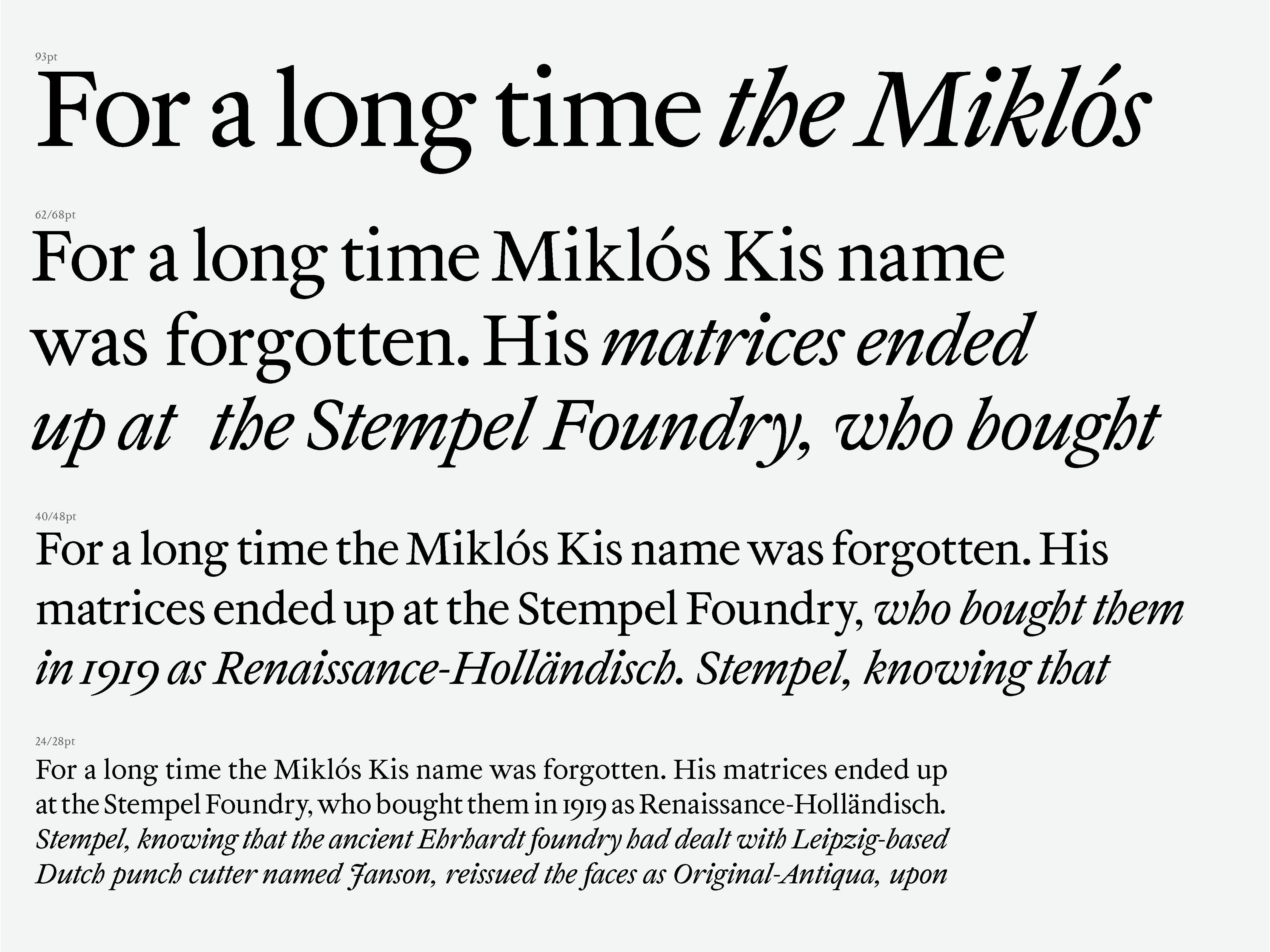
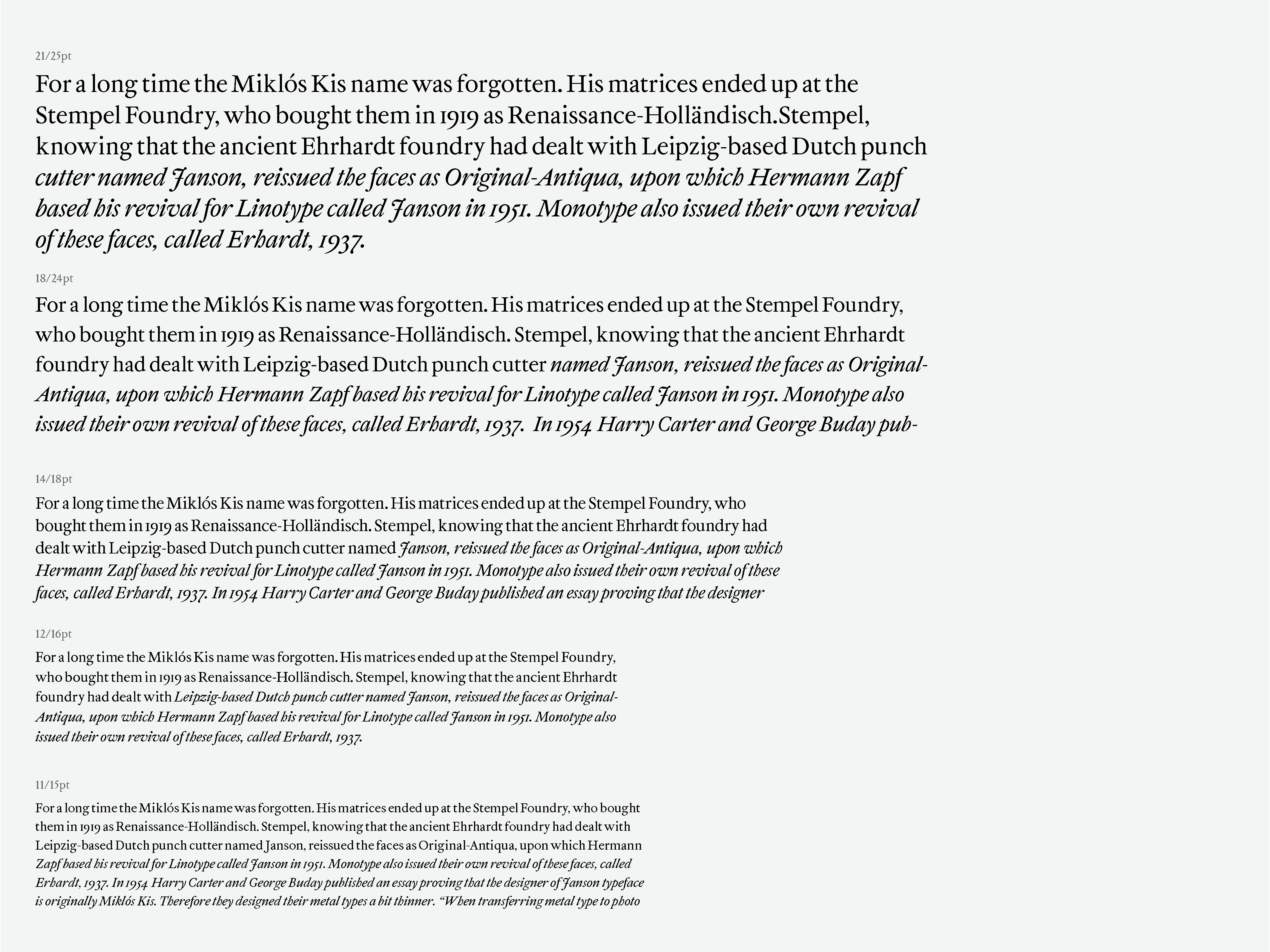
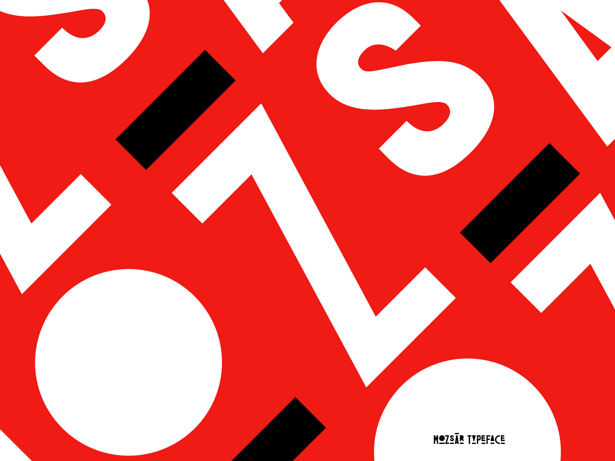
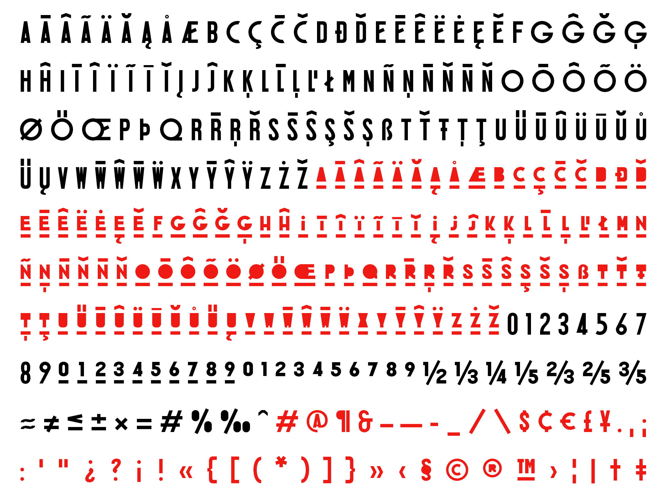
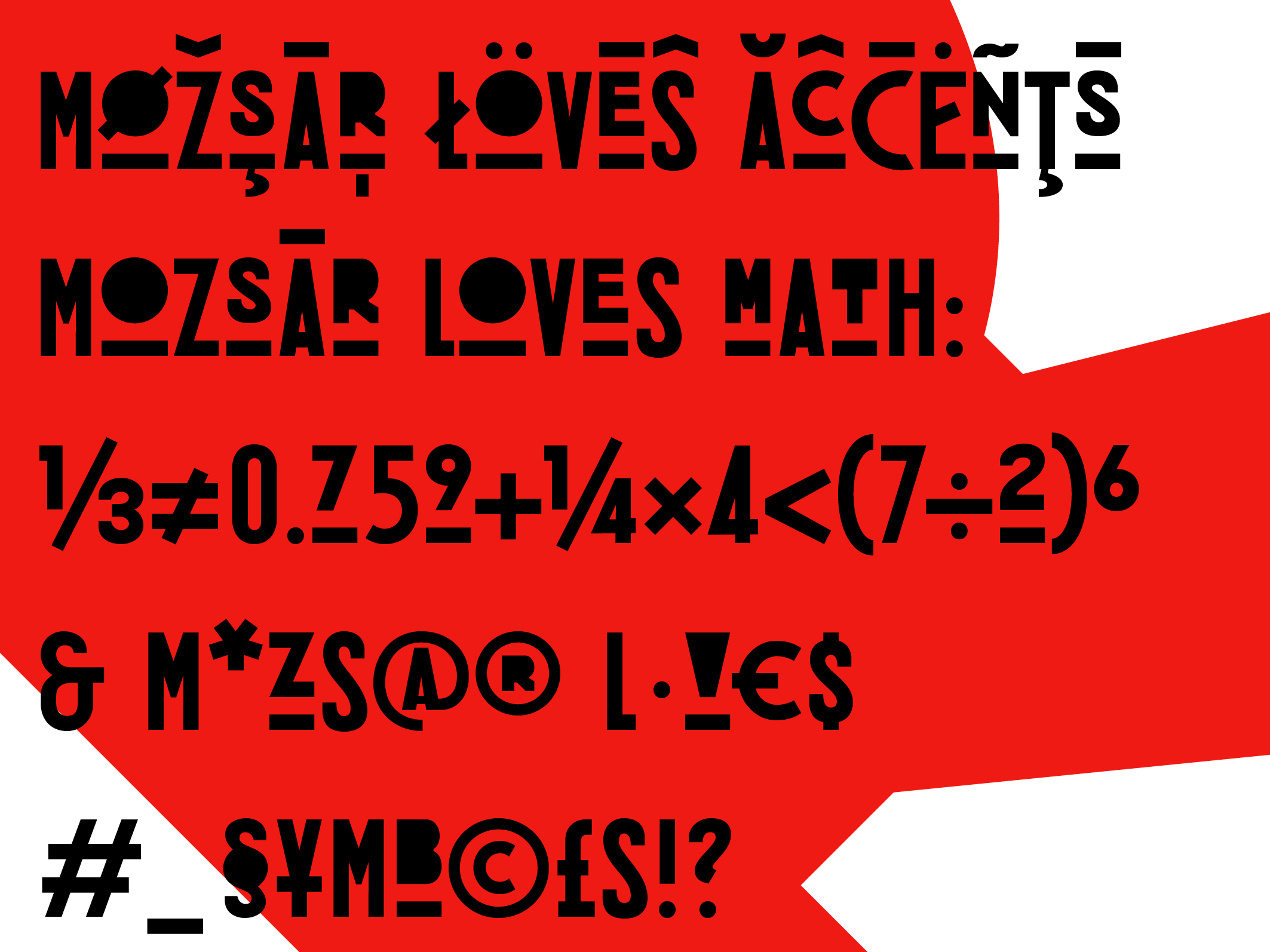
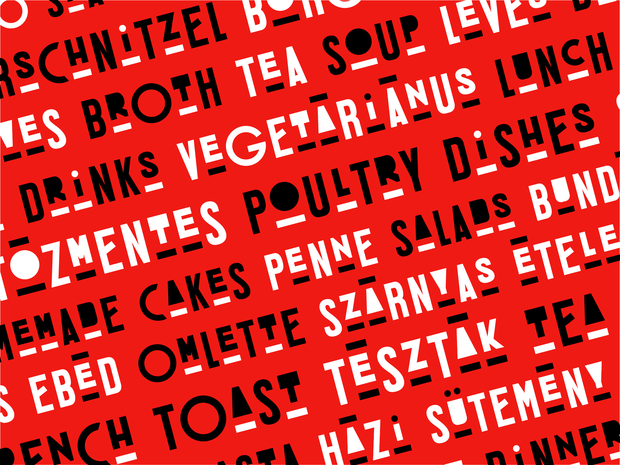
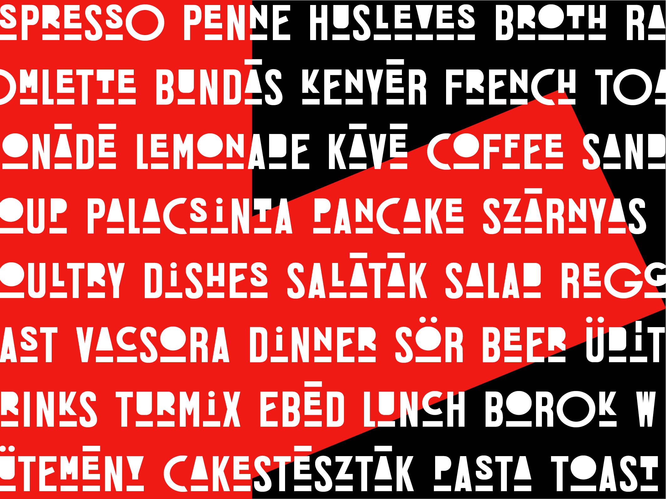
fonts
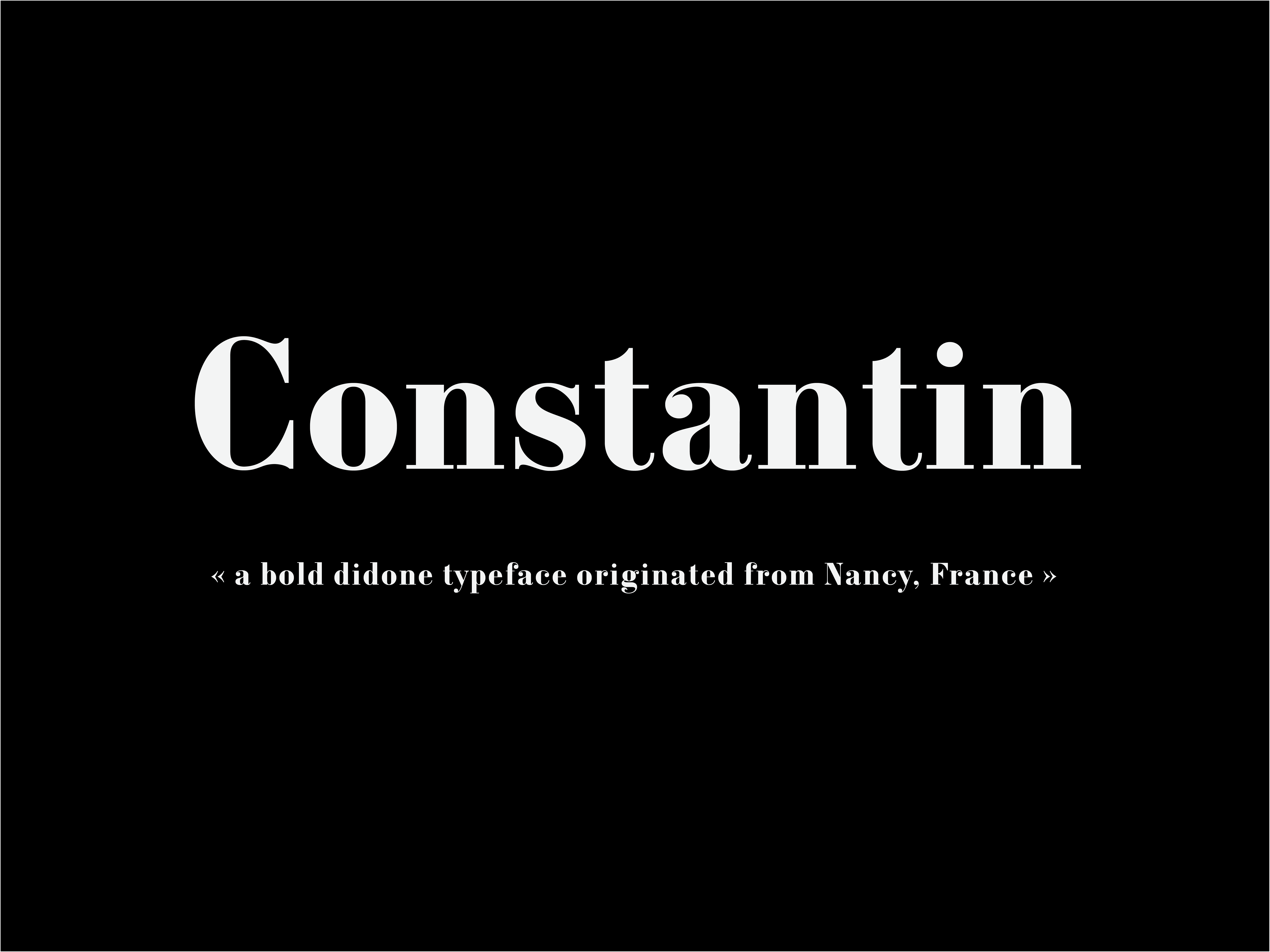
Constantin
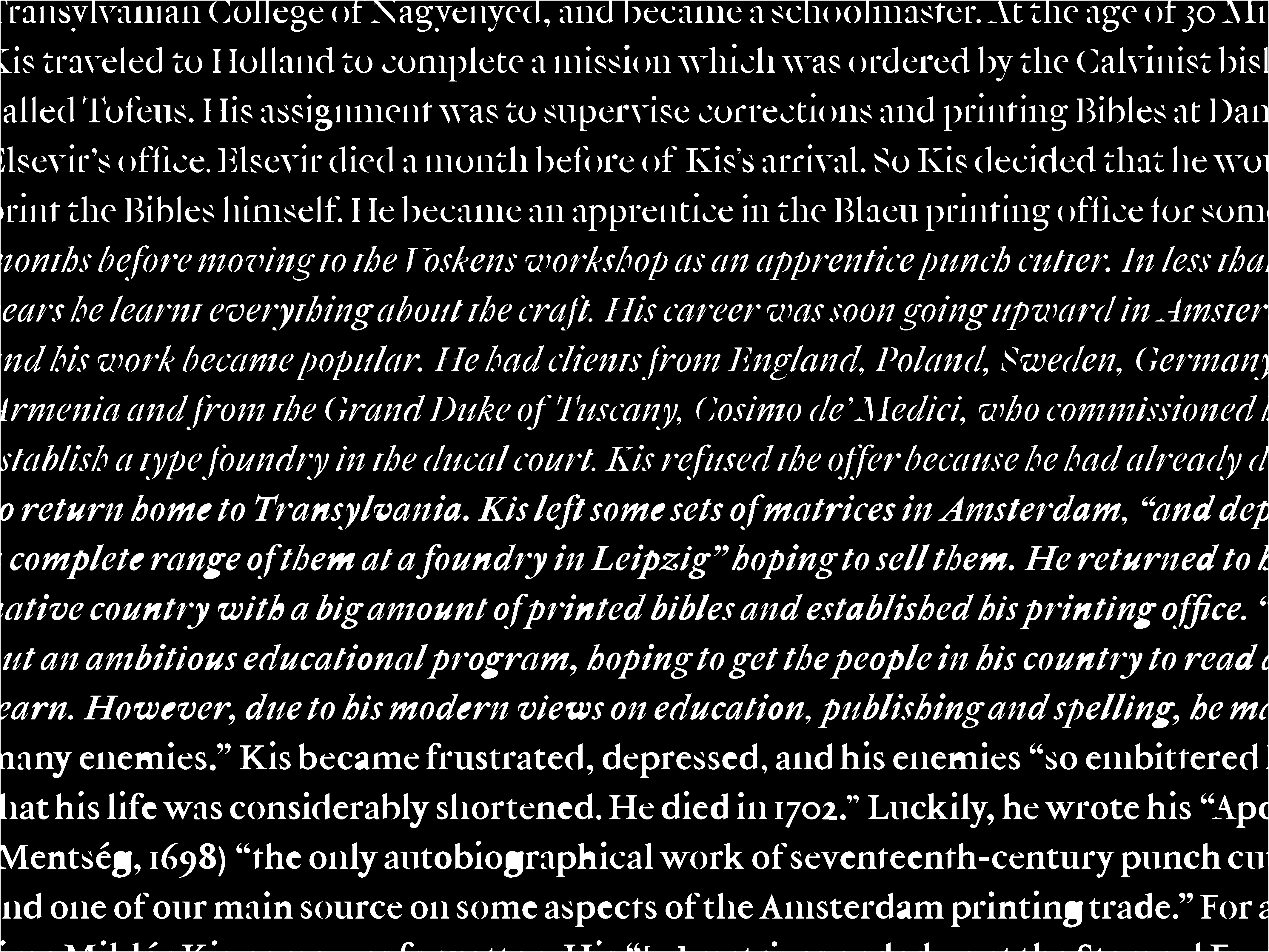
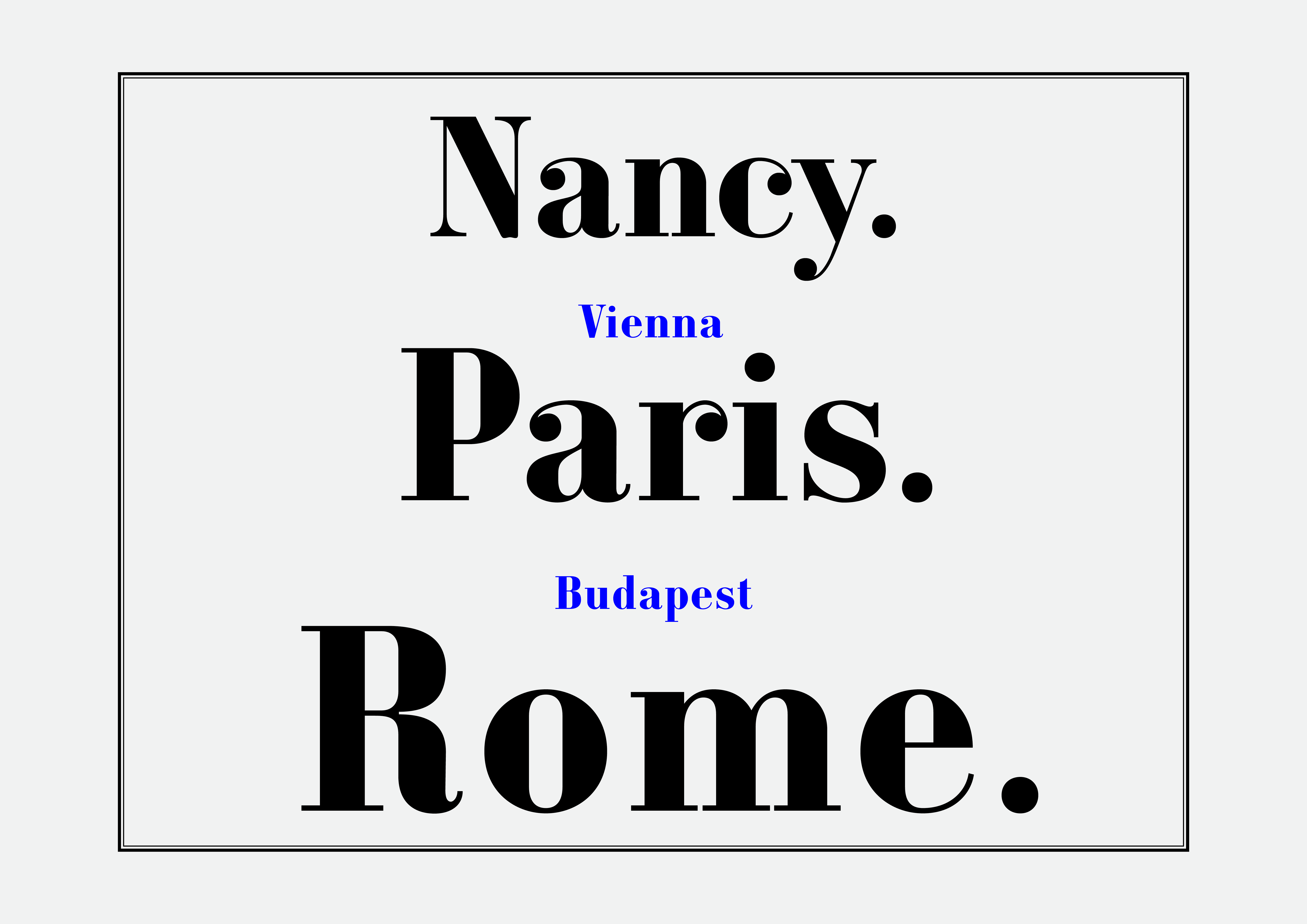
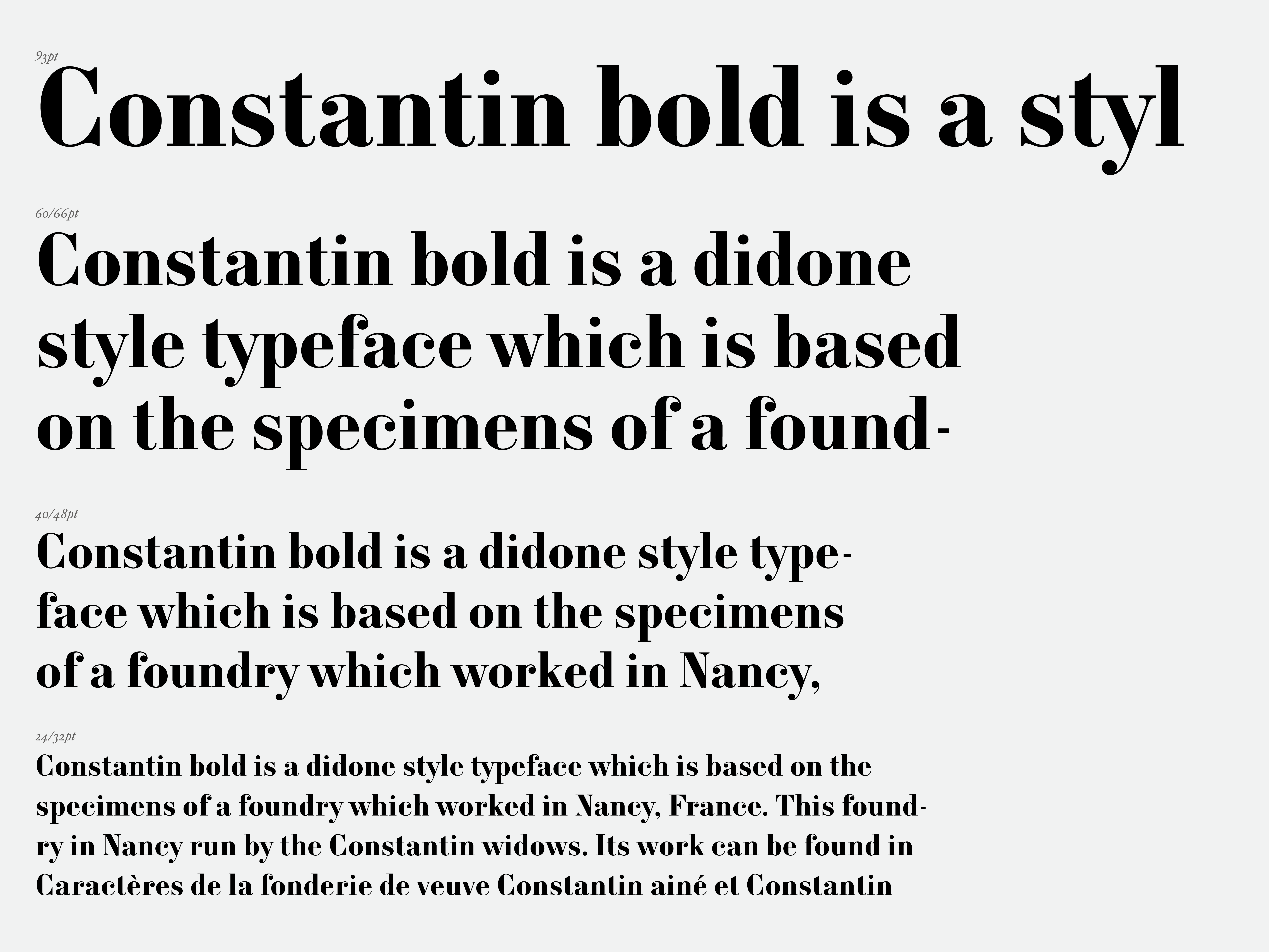
Based on the work of the Constantin widows – whose foundry operated in Nancy, France, during the 19th century – I designed this didone style bold typeface. (Caractères de la fonderie de veuve Constantin ainé et Constantin jeune, à Nancy, Meurthe.)
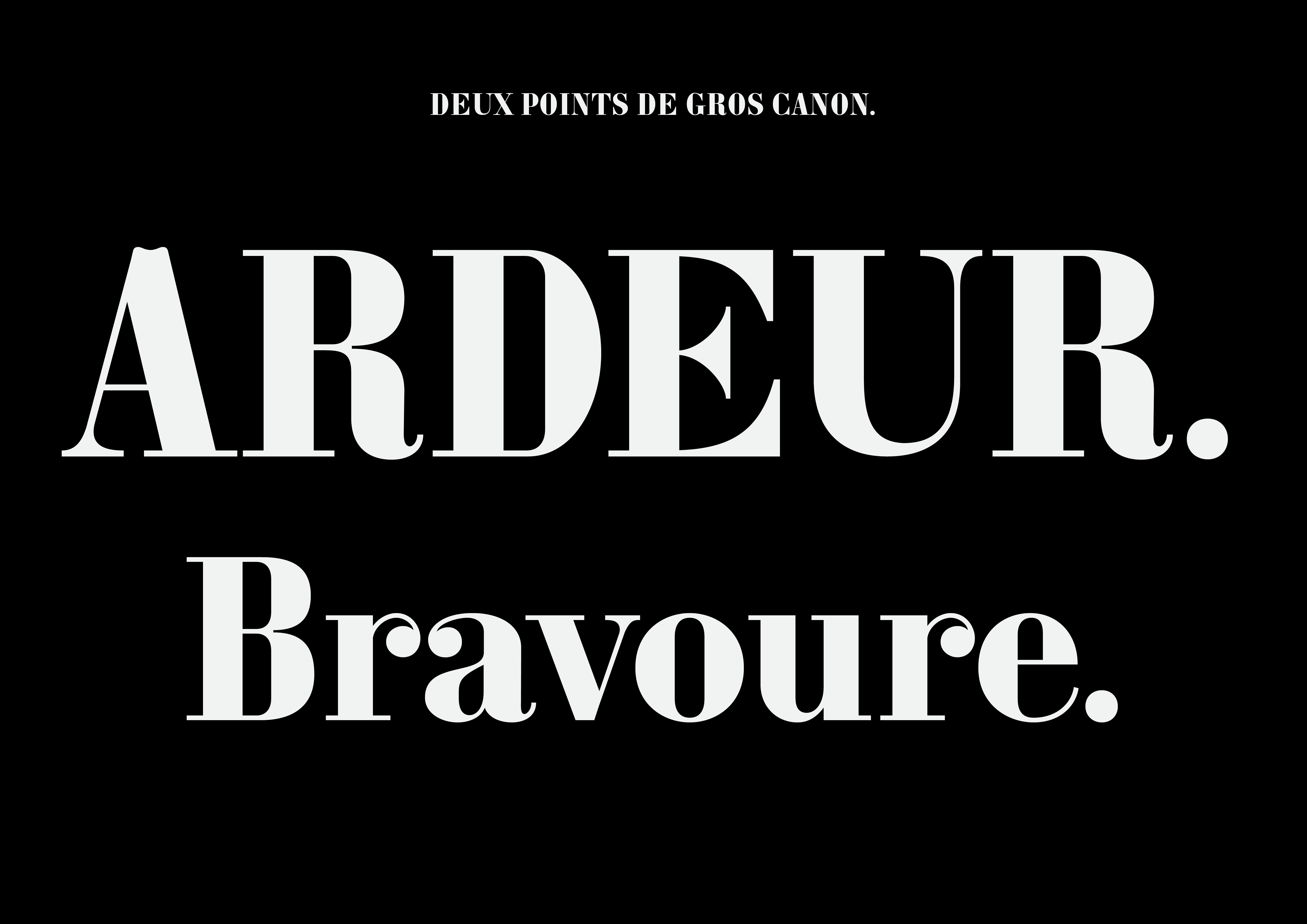
My work offers an interpretation on the original typeface design, and the first sketches were specifically based on the “gros canon” body size letters. In this design, the thick and thin lines are highly contrasted, the stroke terminals end in a round form, and sharp cuts evoke a contemporary feel.
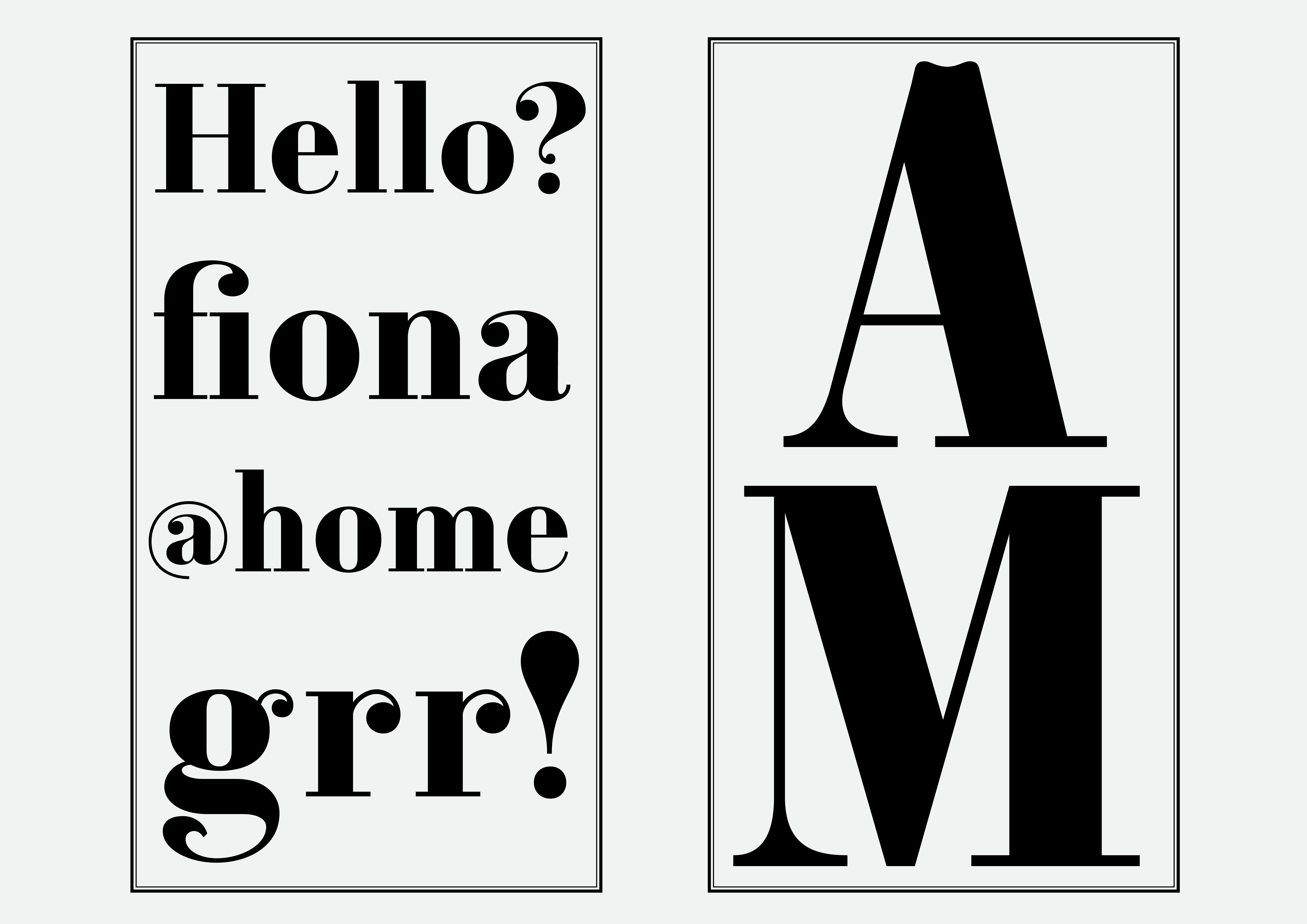
This typeface was originally designed with displays in mind, such as posters. In order to make it applicable to shorter texts and highlights, it was later modified so as to function as a bold weight and heavily contrasted body typeface. The addition of a variety of weights, such as thin, regular, and bold, is still to come.
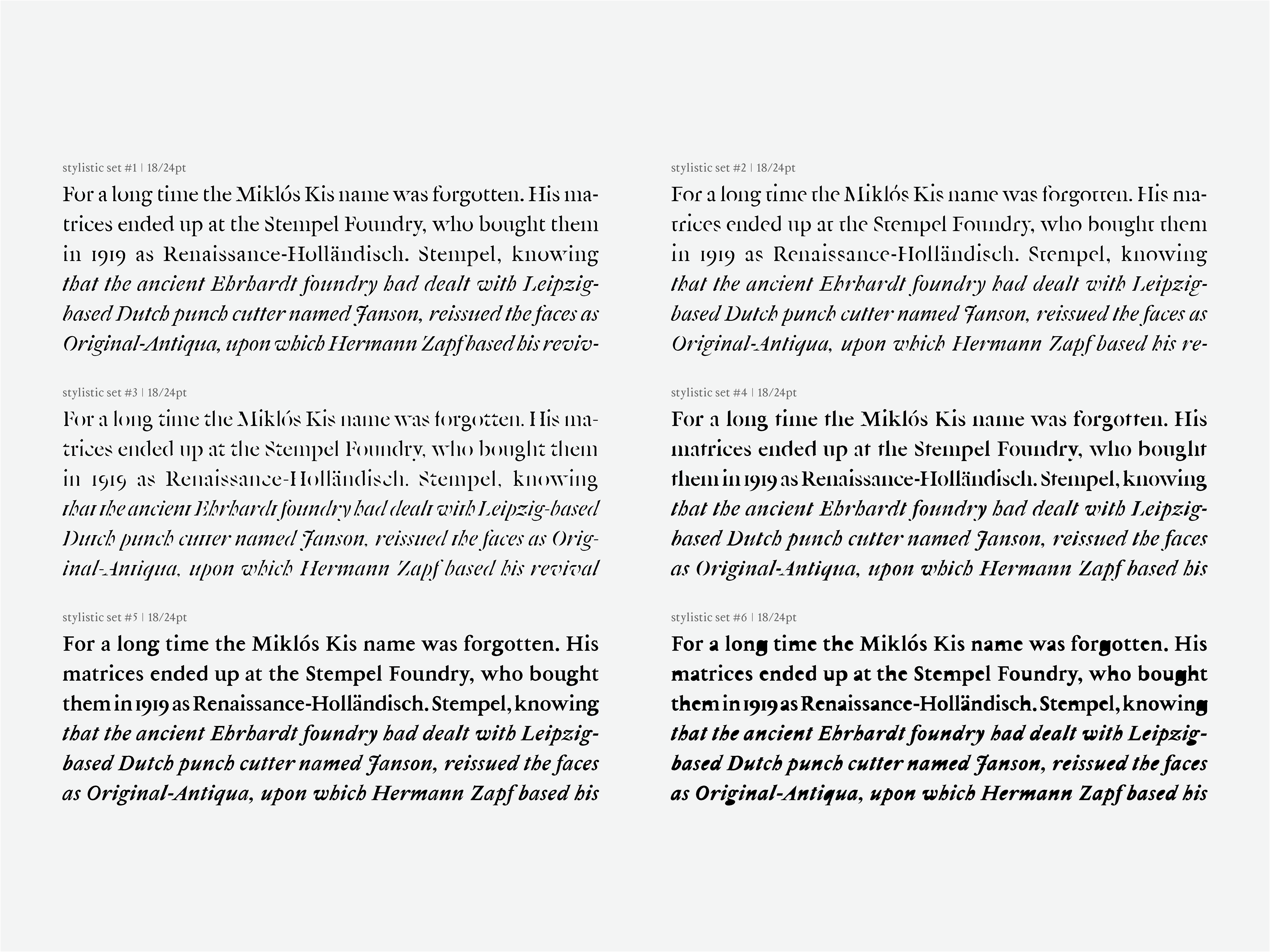
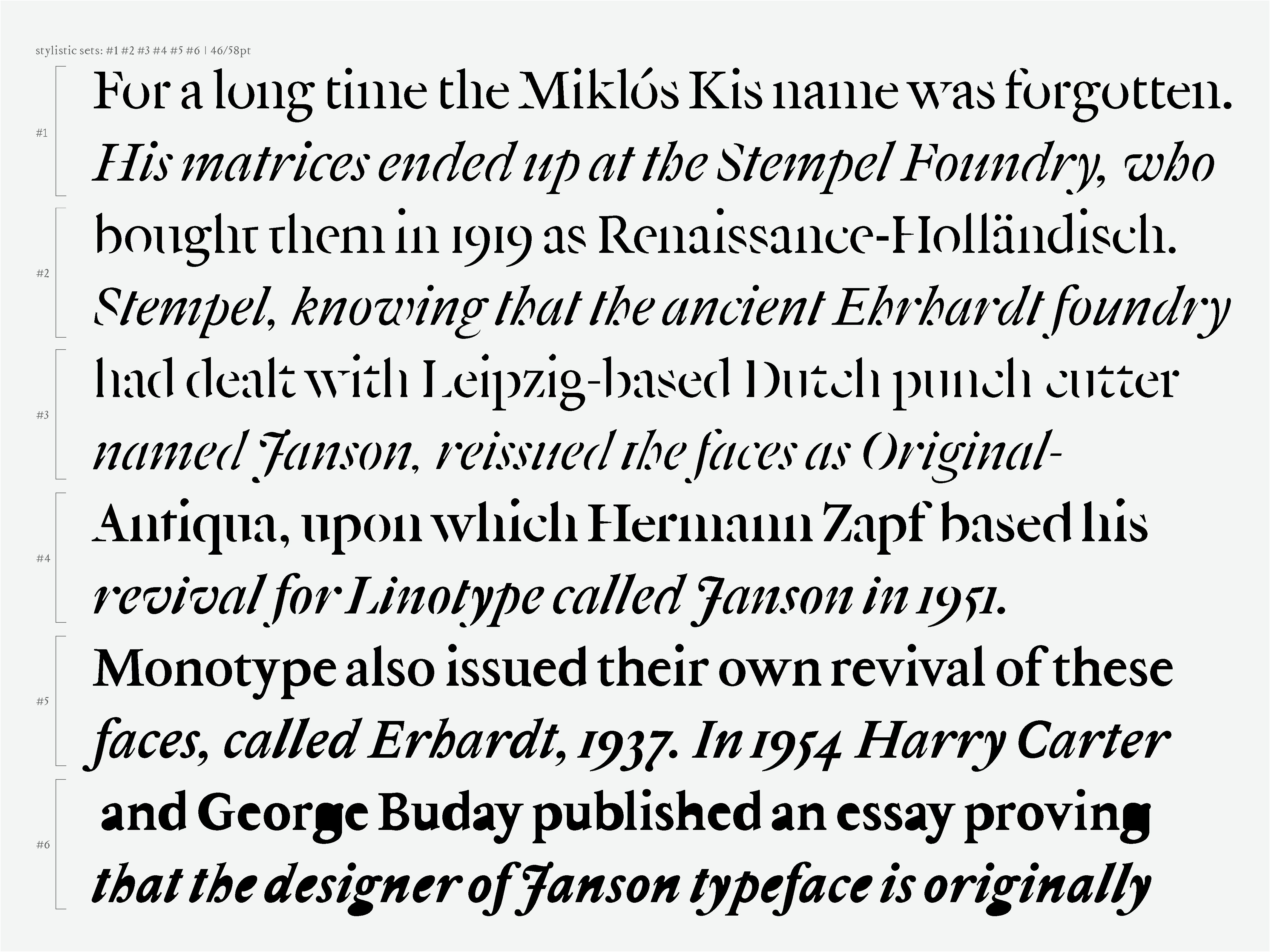
Constantine font family
Constantine Didone Bold – (PDF Specimen)

Desktop Licence
Our Desktop Licence permits the use of our desktop font(s) in printed works, online as static images and embedding into documents. The font may be installed and used at one location and by the maximum number of users specified on your receipt / invoice. Please ensure you read the full terms of the Desktop Licence
Web Font Licence
Our Web Font Licence permits the use of our web font(s) on web servers you control using the CSS @font-face technique. The licence covers one domain and the maximum number of monthly page views specified on your receipt / invoice.Please ensure you read the full terms of the Web Font Licence
Serifmag End User License Agreement
Our End-User Licence allows you to install the fonts on any number of devices which you own or solely control, for simultaneous use by up-to-the-number of users specified. It allows you to print and produce personal or business documents, including PDFs, but this licence does not include webfont use, ebook distribution, or app distribution.
End-User Licences start from €15 for one font for a single user.
Read the full End-User Licence below:
By downloading this font package (“licensed fonts”), you are agreeing to be bound by the terms of this agreement. This agreement, in conjunction with the receipt that accompanies each purchase from Serifmag.com (“Serifmag”), constitutes the complete agreement between you and Serifmag.
-
Allowed uses
You may use the licensed fonts to create images on any surface such as computer screens, paper, web pages, photographs, movie credits, printed material, T-shirts, and other surfaces. You may use the licensed fonts to create EPS files or other scalable drawings provided that such files are only used by the household or company licensing the font. -
Number of users
The maximum number of simultaneous users is specified in the applicable receipt. All users must belong to the same company or household purchasing the licensed fonts. -
Third parties
You may provide the licensed fonts to a graphic designer, printer or other service bureau that is working on your behalf only if they agree to use the licensed fonts exclusively for your work, agree to the terms of this agreement, and retain no copies of the licensed fonts on completion of the work. You may not provide the licensed fonts or make them accessible to any other third parties. -
Embedding
Embedding of the licensed fonts in documents (e.g. PDF files) is permitted for viewing and printing, but not for editing. If someone at a remote location wants to edit a document which contains embedded fonts, they must purchase their own license. Internal corporate documents with embedded fonts may of course be edited on licensed workstations. You may not under embed the licensed fonts into software or hardware products. Such use requires a different license which may be offered through Serifmag. Please contact help@serifmag.com for further information. -
Modifications
You may modify typesetting produced by the licensed fonts in any way you see fit. You may also modify the licensed fonts for your own personal or internal business use, but you may not distribute, or transfer your adaptations; for instance, (a) you may not make customized versions of the licensed fonts for use by your clients, (b) you may not adapt, or merge the licensed fonts to create hybrid Fonts for resale. Each workstation where a modified licensed fonts is installed shall be counted as one of your permitted number of users. -
Unauthorized copying of the licensed fonts even if modified, merged, or included with other software, or of the written materials, is expressly forbidden. You may be held legally responsible for any infringement of Miklós Ferencz intellectual property rights that is caused or encouraged by your failure to abide by the terms of this agreement.
-
Termination
This agreement is effective until terminated. This agreement will terminate automatically without notice from Serifmag if you fail to comply with any provision contained herein. Upon termination, you must destroy the licensed fonts, and all copies of them, in part and in whole, including modified copies, if any. -
Product Upgrades
Serifmag may, from time to time, update the licensed fonts. Product upgrade pricing may apply. -
Disclaimer and Limited Warranty
Serifmag warrants the licensed fonts to be free from defects in materials and workmanship under normal use for a period of twenty one (21) days from the date of delivery as shown on your receipt. Serifmag's entire liability and your exclusive remedy as to a defective product shall be, at Serifmag’s option, either return of purchase price or replacement of any such product that is returned to Serifmag with a copy of the invoice. Serifmag shall have no responsibility to replace the product or refund the purchase price if failure results from accident, abuse or misapplication, or if any product is lost or damaged due to theft, fire, or negligence. Any replacement product will be warranted for twenty one (21) days.
This warranty gives you specific legal rights. You may have other rights, which vary from state to state, country to country. EXCEPT AS EXPRESSLY PROVIDED ABOVE, THE PRODUCT, IS PROVIDED “AS IS”. SERIFMAG FONTS DOES NOT MAKE ANY WARRANTY OF ANY KIND, EITHER EXPRESSED OR IMPLIED, INCLUDING, BUT NOT LIMITED TO THE IMPLIED WARRANTIES OF MERCHANTABILITY AND FITNESS FOR A PARTICULAR PURPOSE. The entire risk as to the quality and performance of the licensed fonts rests upon you. Serifmag does not warrant that the functions contained in the licensed fonts will meet your requirements or that the operation of the software will be uninterrupted or error free. SERIFMAG SHALL NOT BE LIABLE FOR ANY DIRECT, INDIRECT, CONSEQUENTIAL, OR INCIDENTAL DAMAGES (INCLUDING DAMAGES FROM LOSS OF BUSINESS PROFITS, BUSINESS INTERRUPTION, LOSS OF BUSINESS INFORMATION, AND THE LIKE) ARISING OUT OF THE USE OF OR INABILITY TO USE THE LICENSED FONTS EVEN IF SERIFMAG’S FONTS HAS BEEN ADVISED OF THE POSSIBILITY OF SUCH DAMAGES. Because some states or countries do not allow the exclusion or limitation of liability for consequential or incidental damages, the above limitation may not apply to you.
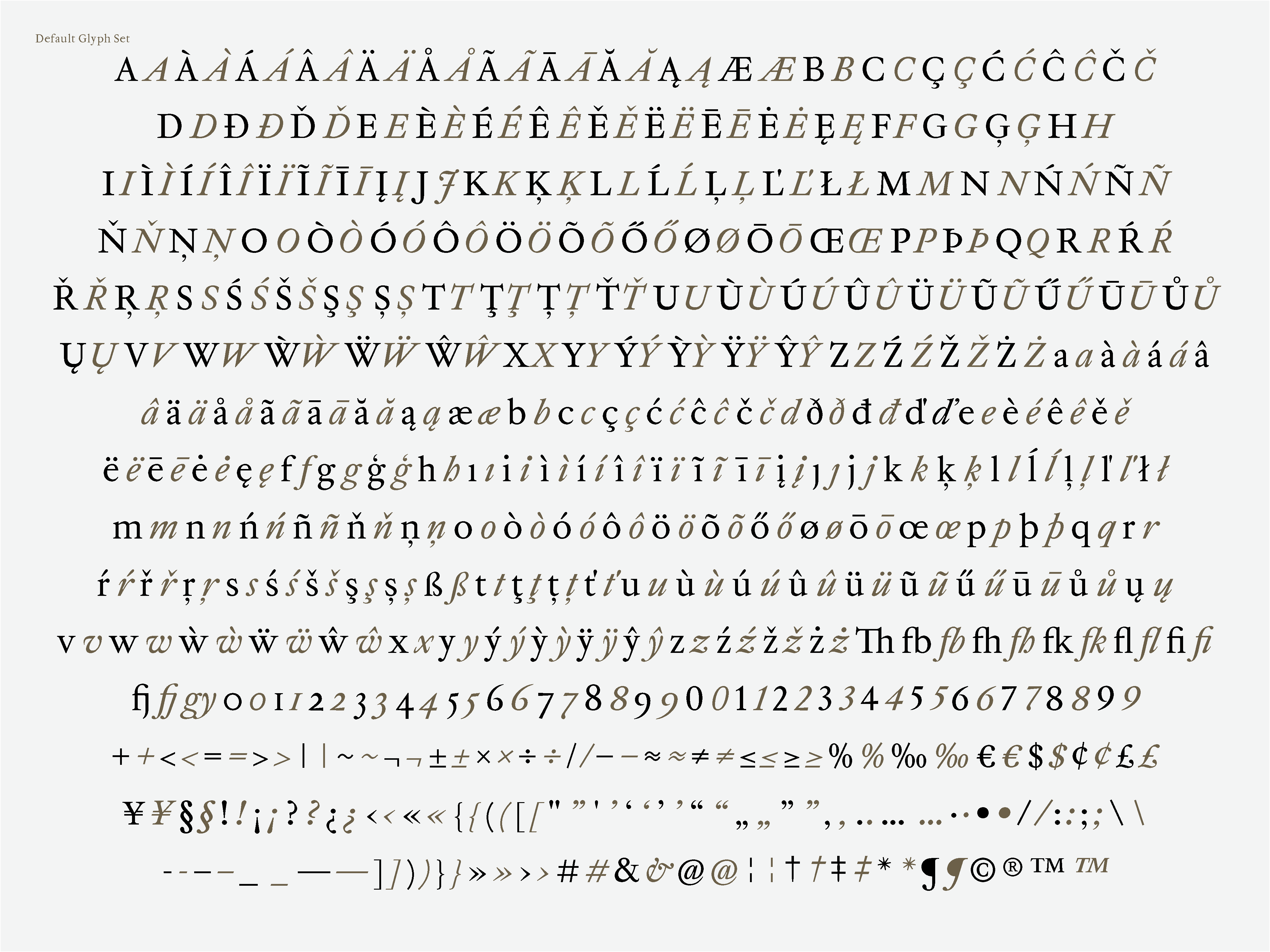
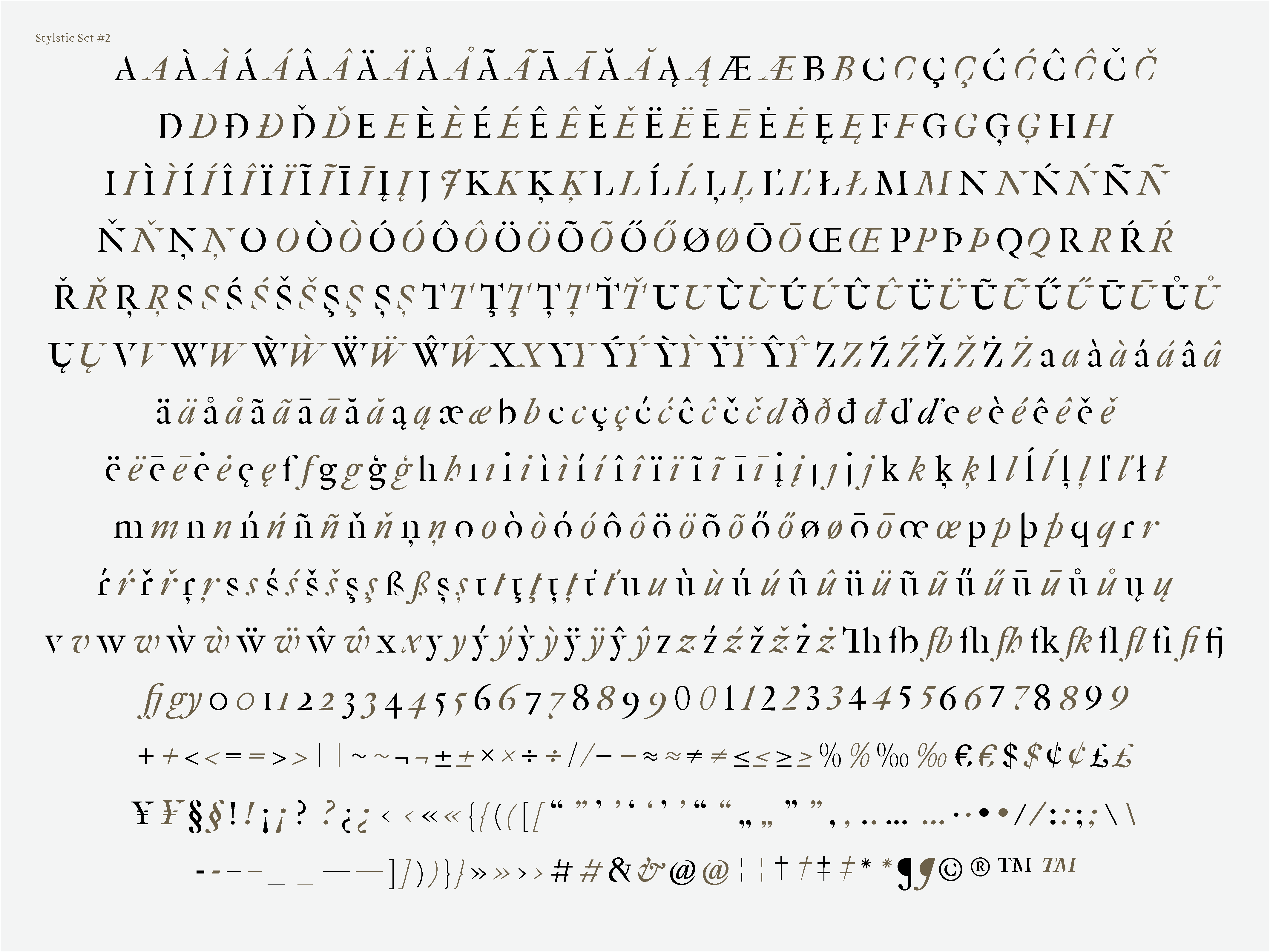
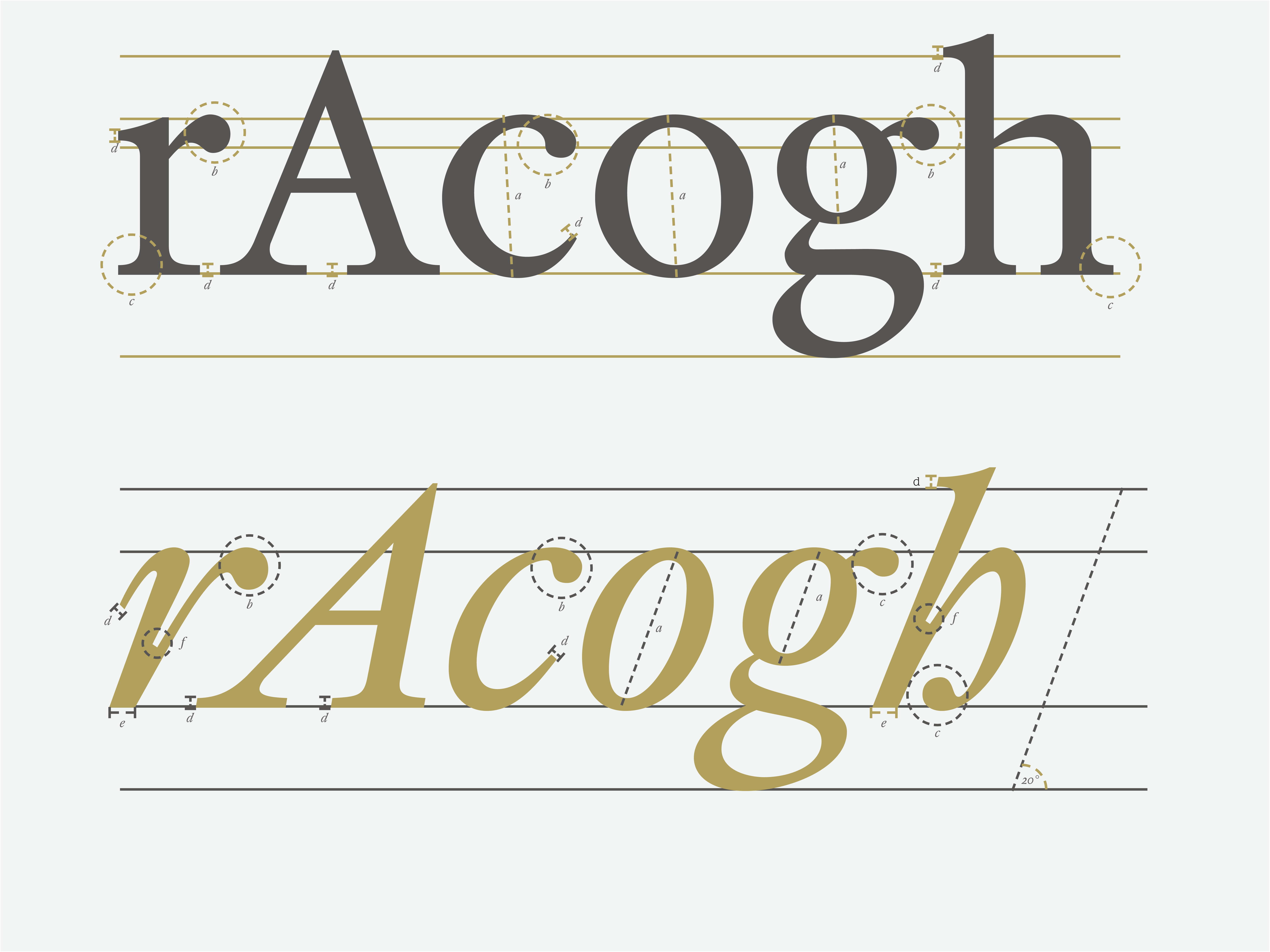
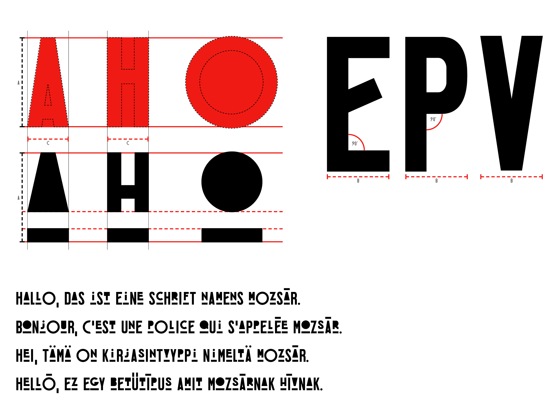
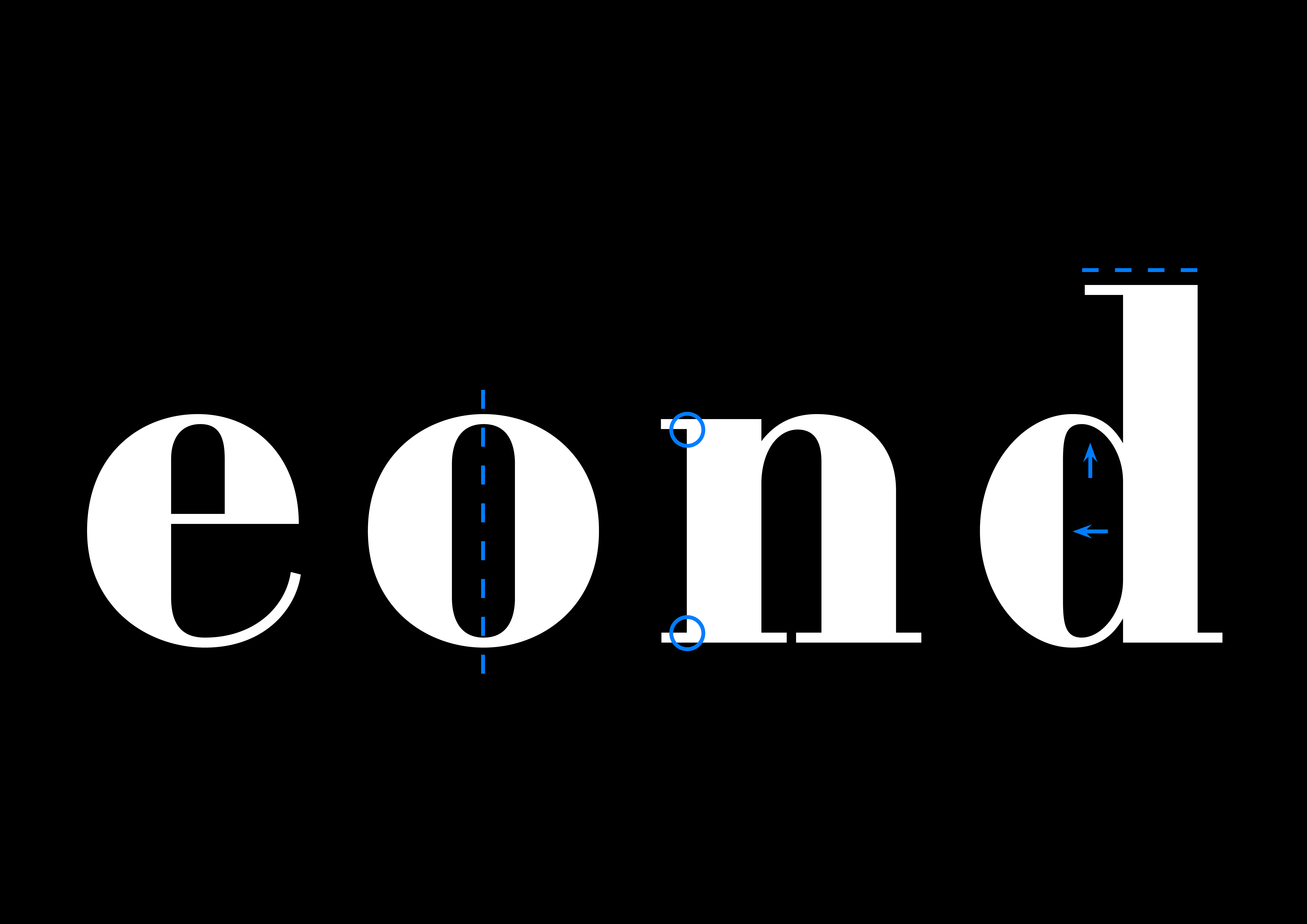
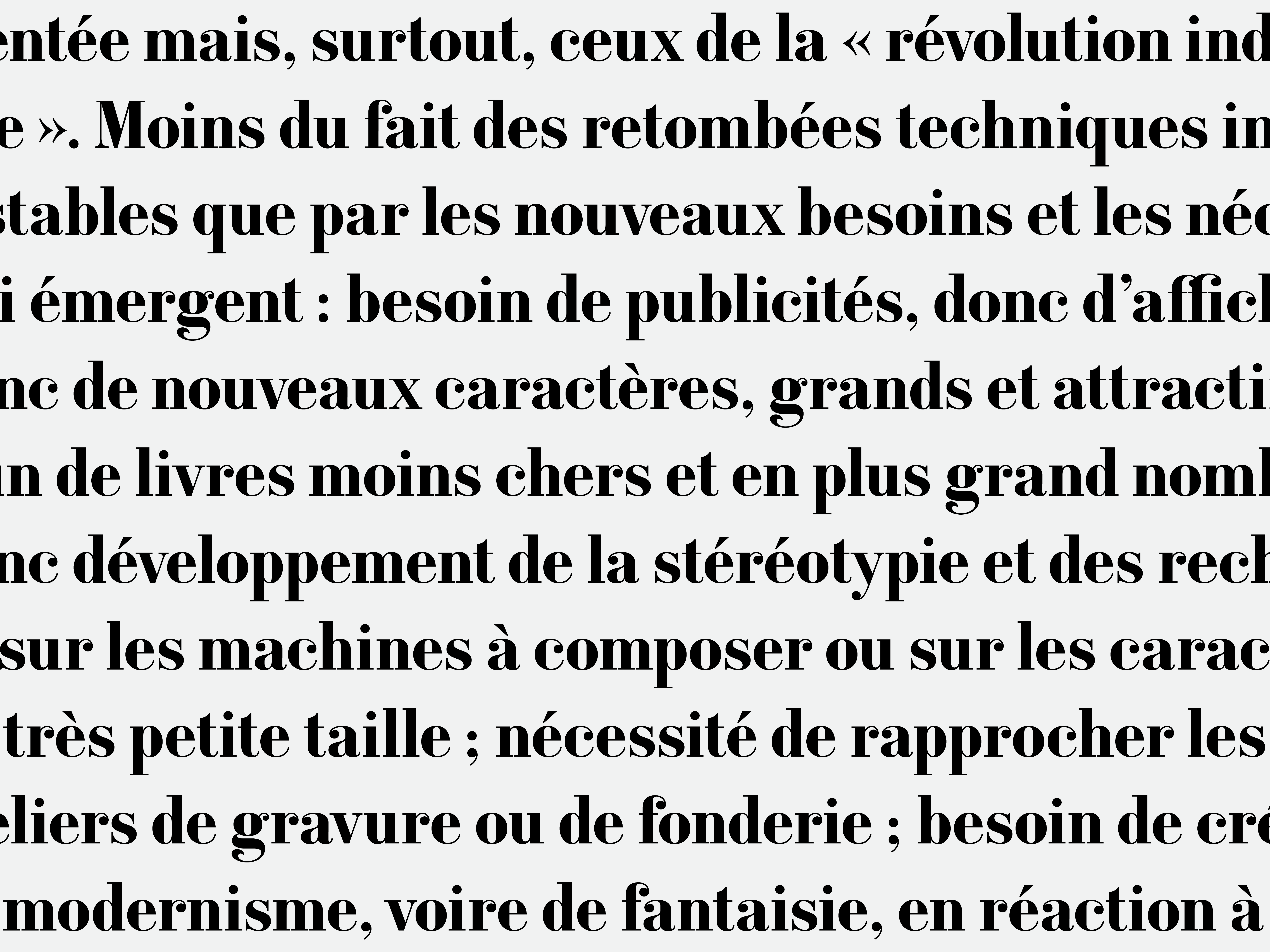
With Constantin being a didone style typface, the axis of the ‘o’ has a precisely vertical stress, as well as that of the ‘e’, ‘g’ and all the round letters. In many cases, the stroke terminals are ball shaped. However, rather than bridging the ‘ball’ and the stroke with a lightly curved arc, the terminal is adjoined in an acute angle, signifying the insertion of the typeface into the digital medium. The contrast between thin and thick lines is abrupt and dramatic, and the width of the thin strokes is always the same and is equal to the height of the serifs. The serifs are un-bracketed and thin. In sum, the typeface was constructed in a systematic and logical fashion: the shapes can be divided into separate groups, creating a coherent system, and rendering the texture vibrant yet legible.


Constantine is distributed for the first time here, on Serifmag.