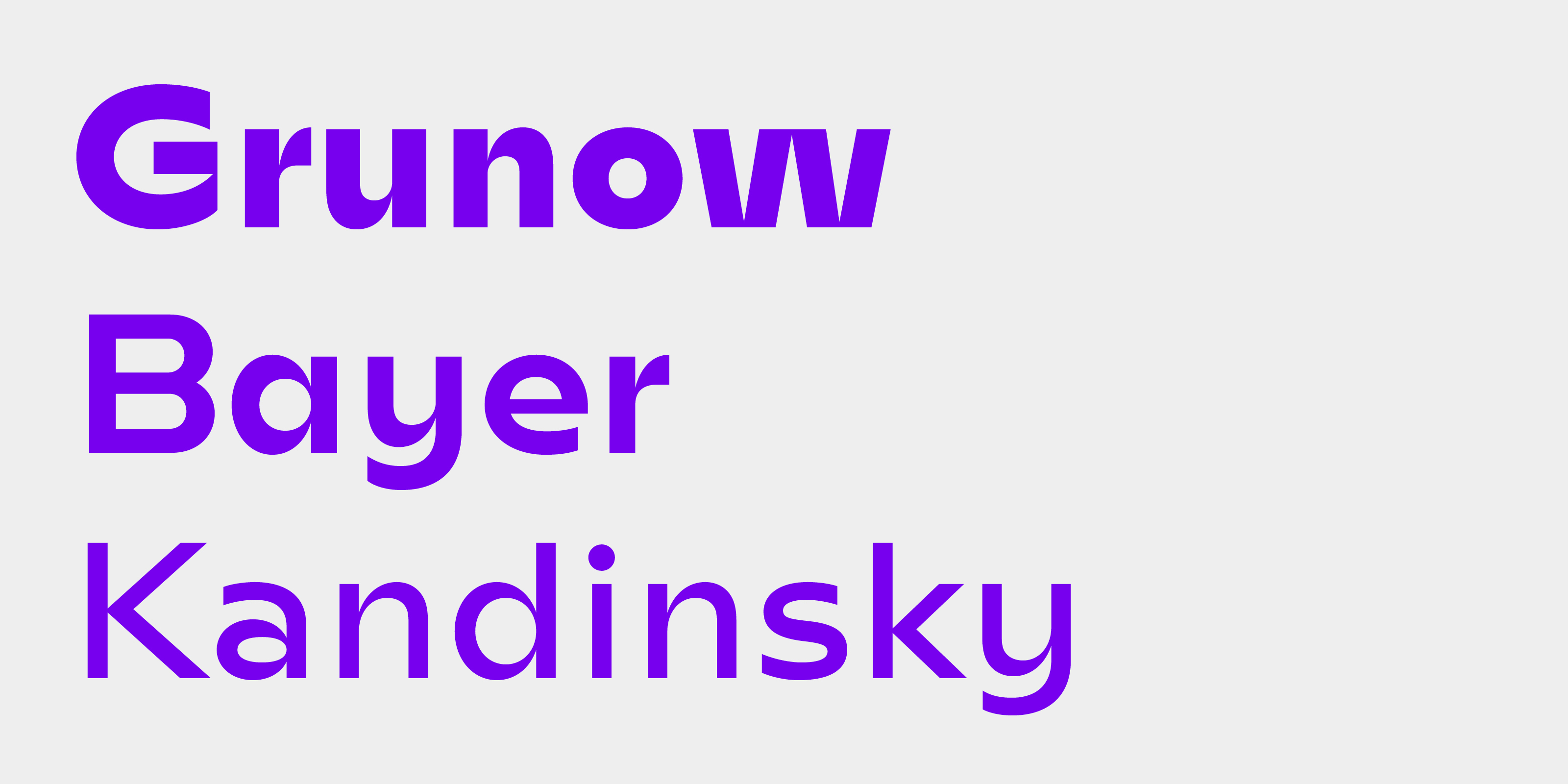
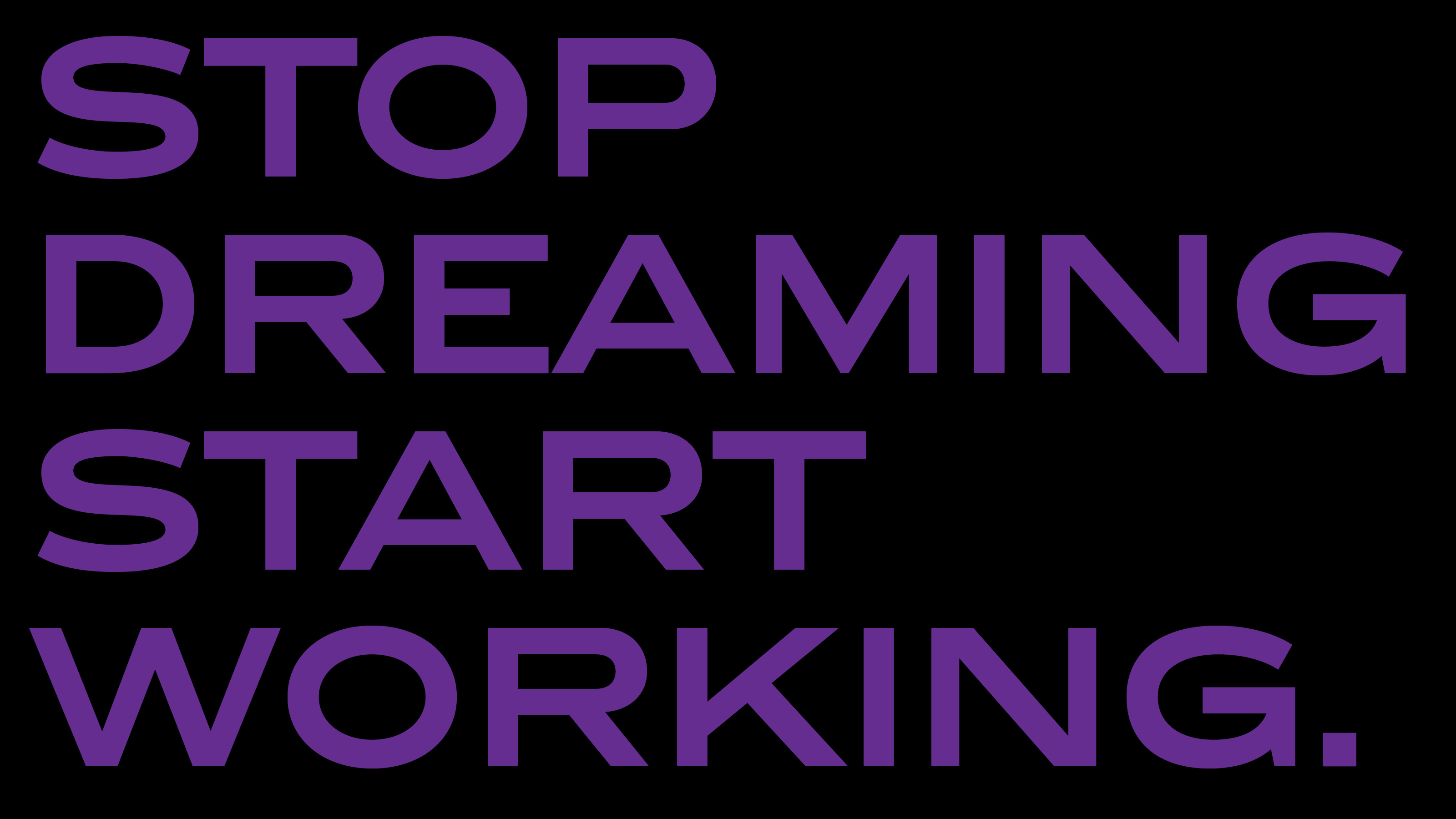
Betűtervező
Katyi Ádám – Hungarumlaut Type Foundry
Adam Katyi graduated at Type and Media at the Royal Academy of Art in The Hague, The Netherlands. Since then he is working as an independent type- and graphic designer in his own studio in Graz, Austria. Adam is a returning teacher in the Moholy-Nagy Art and Design University and in the Institute of Applied Arts in Sopron. He also holds type design workshops, where he teaches type design from the basics to newest, more complicated techniques.
fontok, betűcsaládok
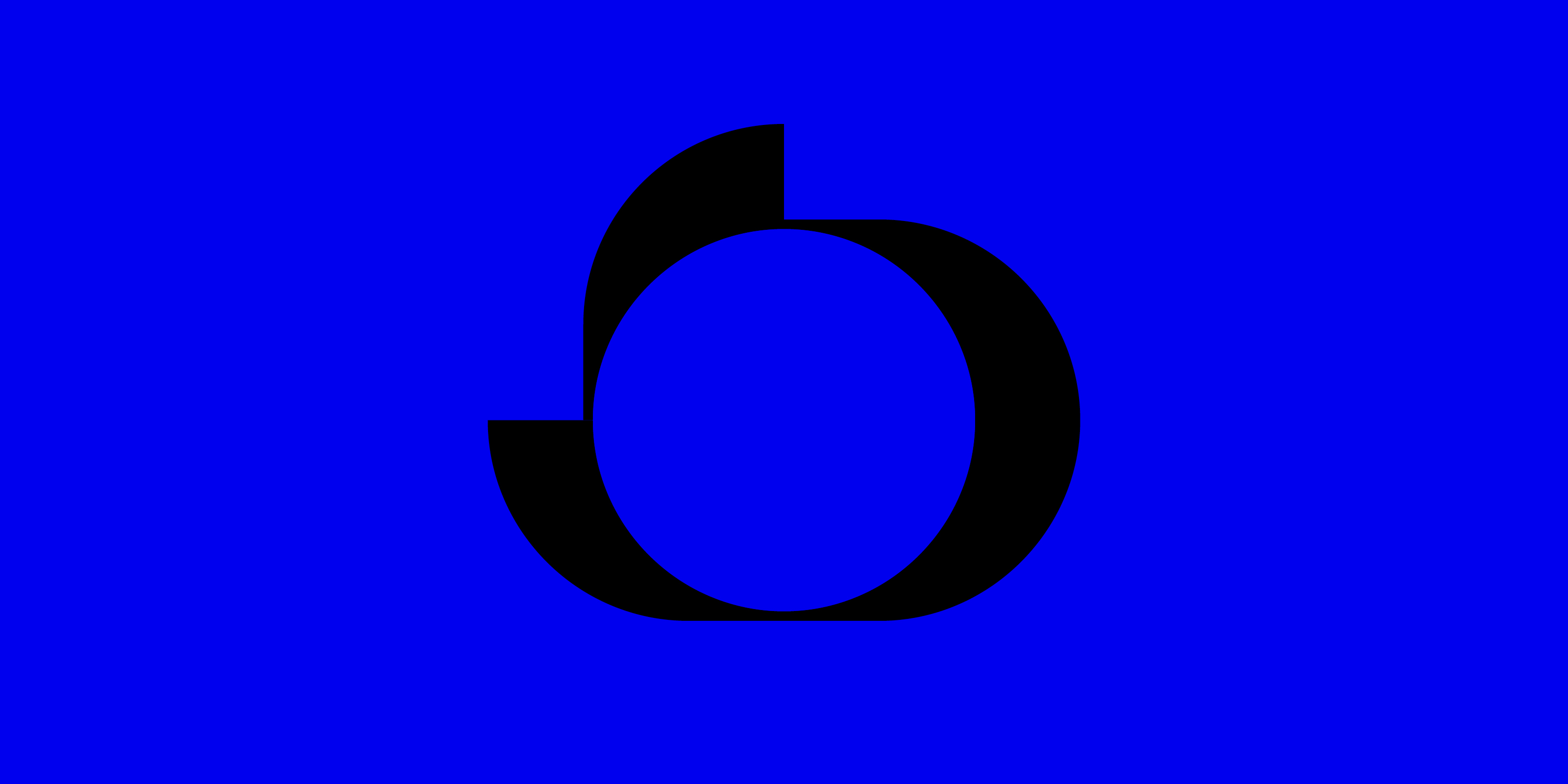
Mohol 2016 – 2018
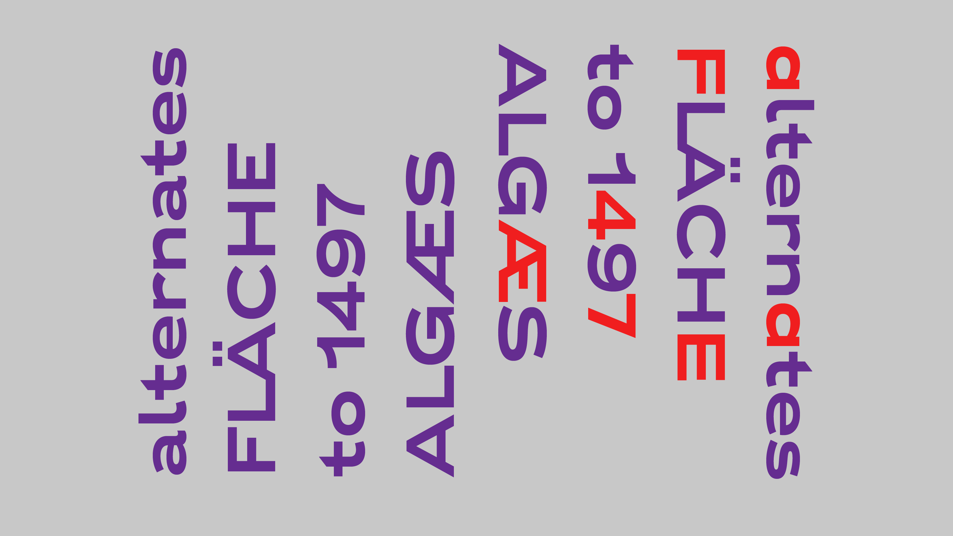
Mohol is an experimental high-contrast sans serif typeface. The project started with Áron Jancsó’s question: “What is the best way to design a sans serif, mono-linear typeface with an old classical tool, like a broad nib pen?”.
Mohol was originally designed for the László Moholy-Nagy Design Grant in 2016. The brief was to design a new typeface, in respect of László Moholy-Nagy’s work and heritage. He was the most famous Hungarian in the Bauhaus, painter, photographer. Moholy-Nagy was influenced by constructivism and a strong advocate of the integration of technology and industry into the arts.
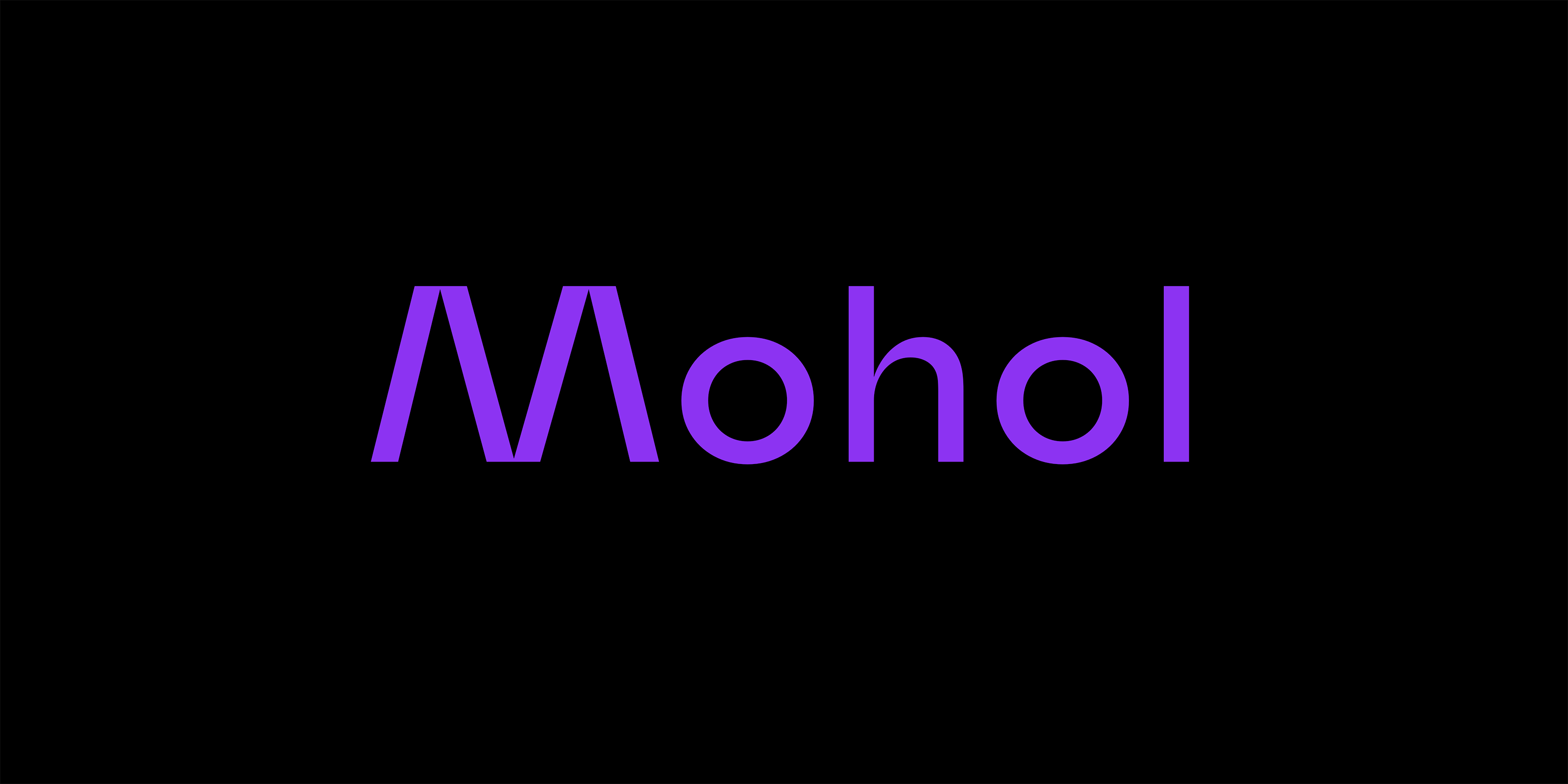
The experiments starts with brushes and Pilot Parallel Pens. I wanted to draw sans-serif letters with similar horizontal and vertical strokes. I held the brush and the pen only vertical and only horizontal. I drew all the characters with a flat brush and a pilot pen. With different pen-widths I could sketch the different weights of the typeface.
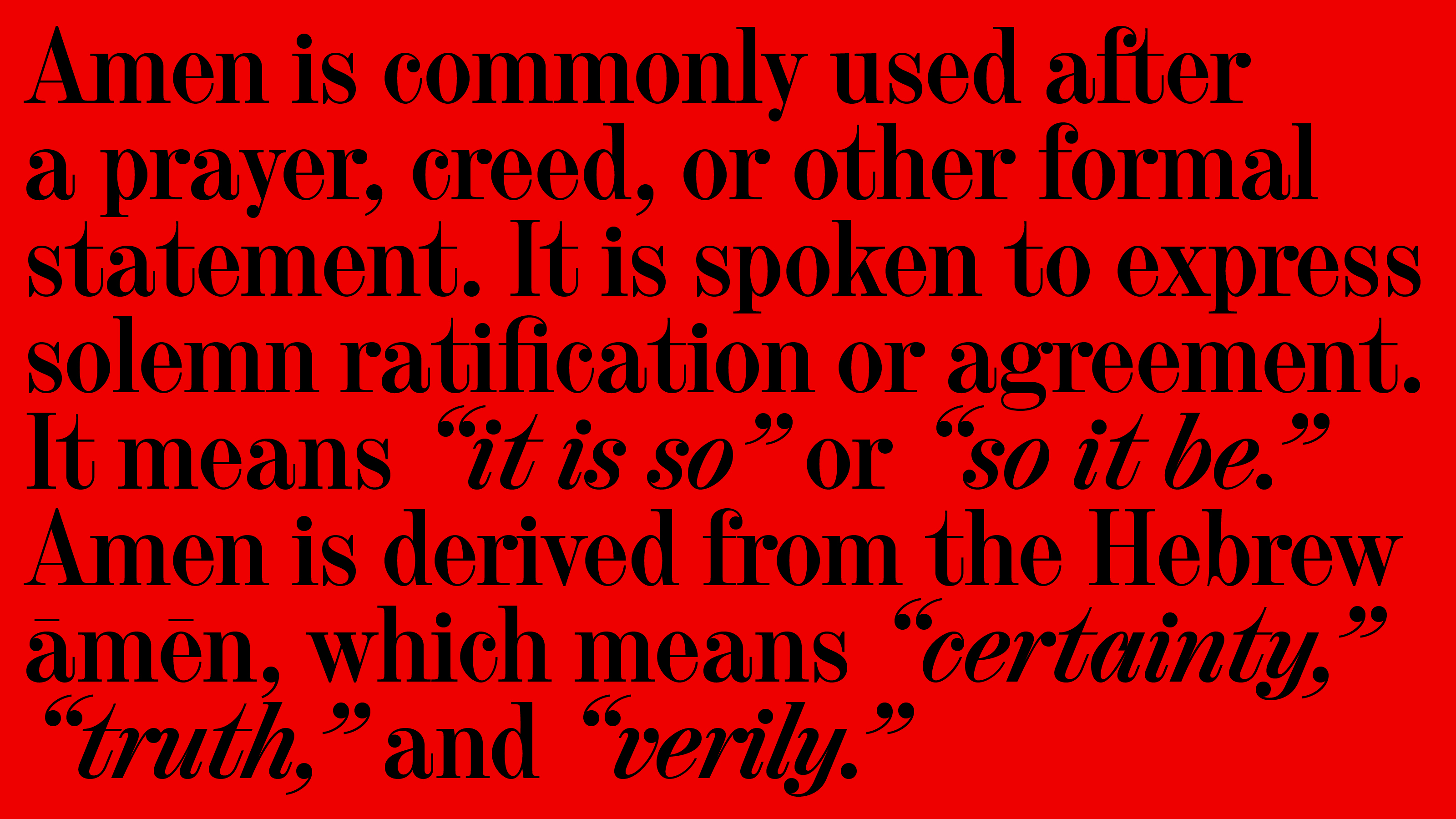
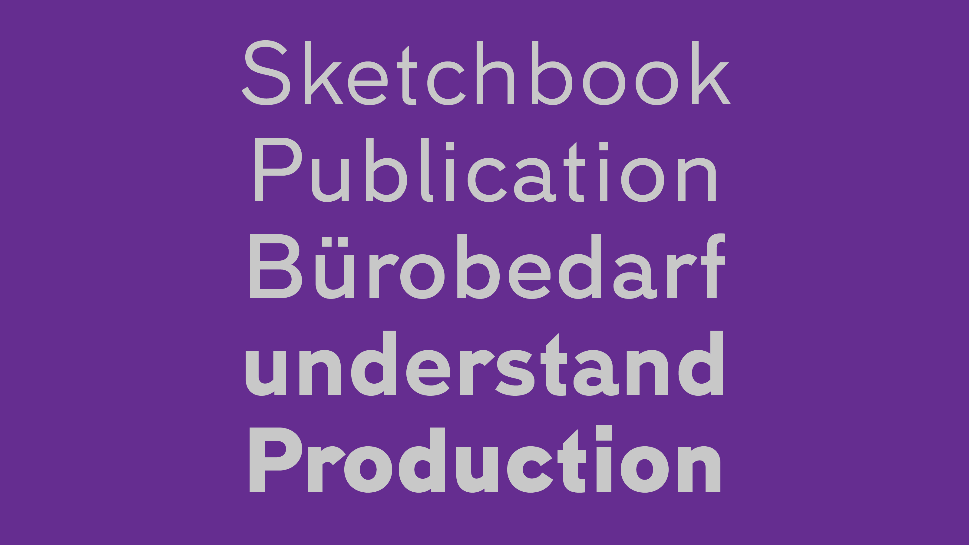
Amen Display 2013 – 2018
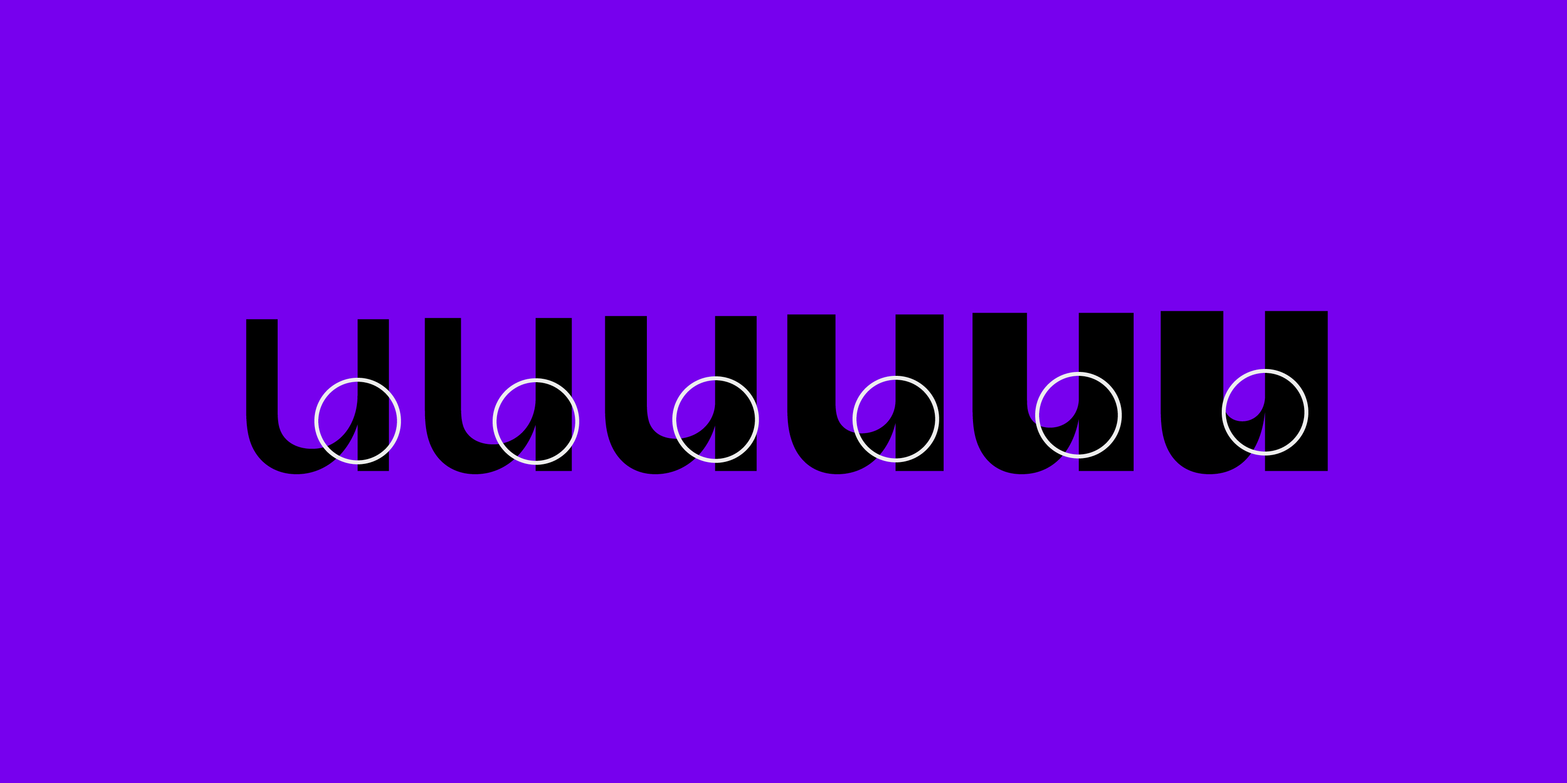
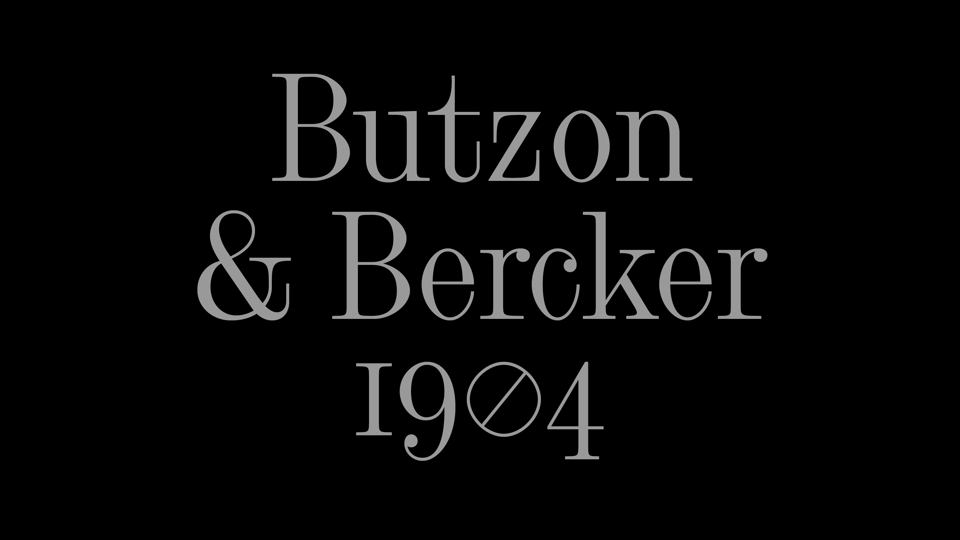
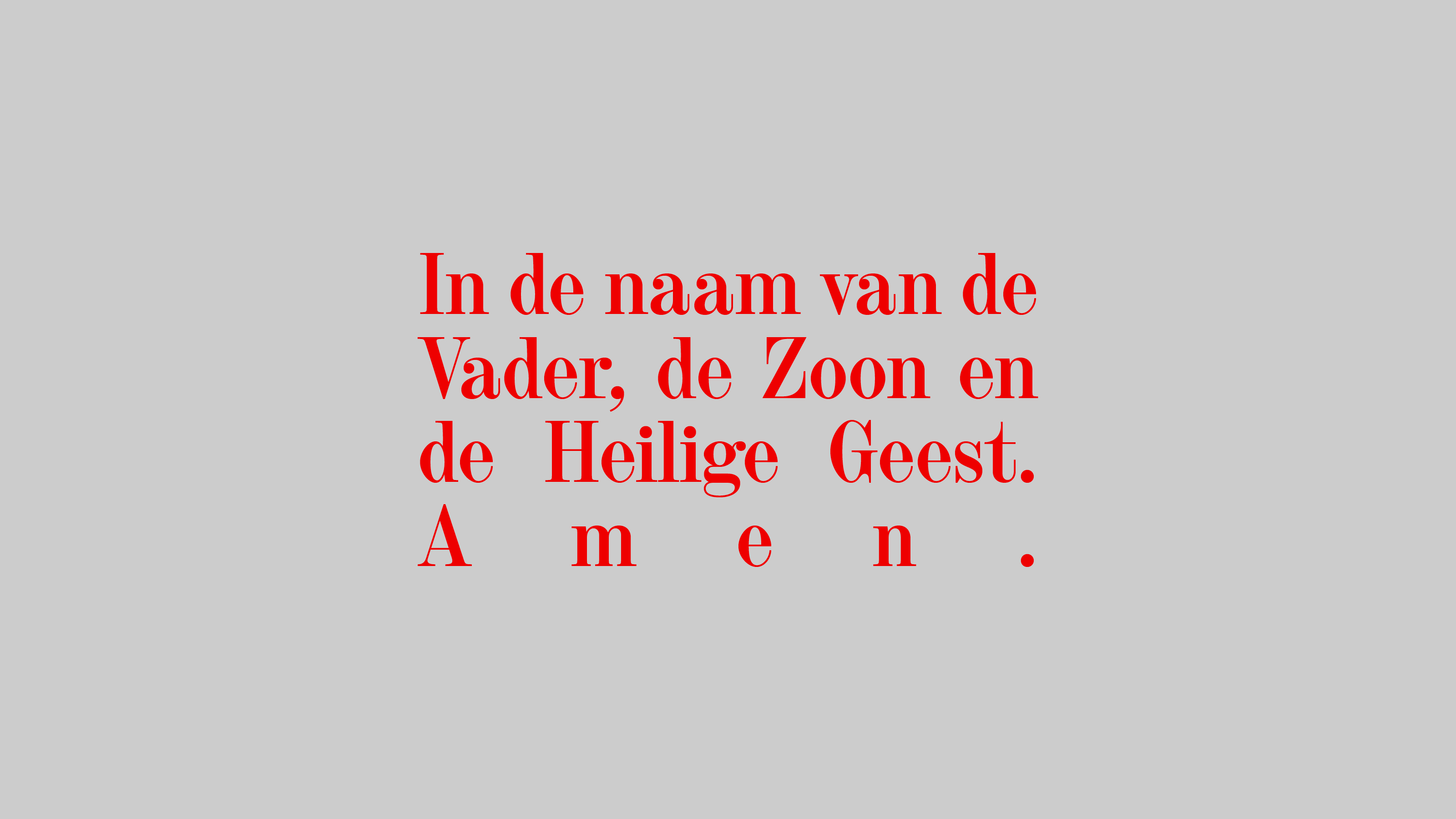
I made the first sketches and digital files at my Type and Media studies as a revival project under the name Gewaard. Project leader: Paul van der Laan. The Medium weight is an interpretation of Halfvette Aldine, shown in the Lettergieterij Amsterdam specimen of c.1906. I’ve found the original typeface on an old prayer-book, from Butzon and Bercker, Kevelaer, 1904. The type was set in large size, in 24 pt.
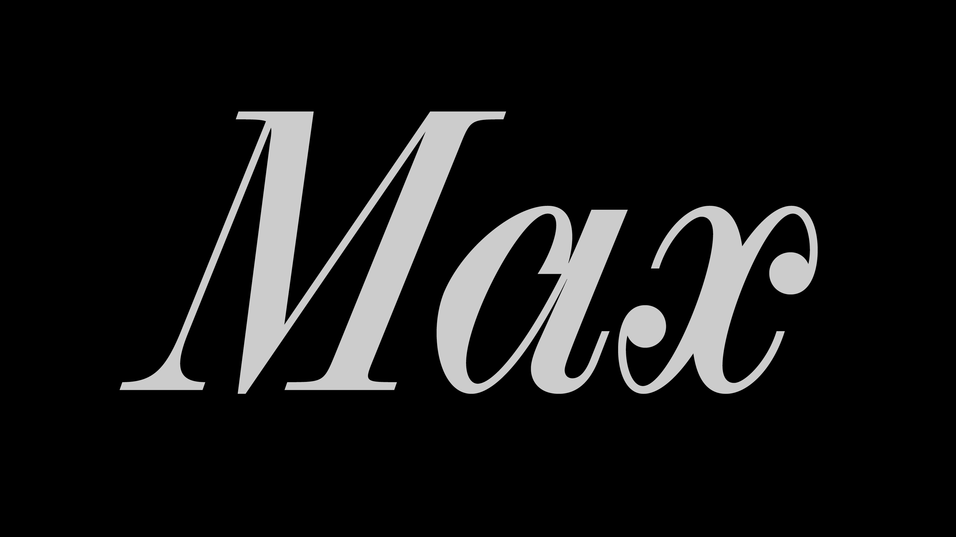
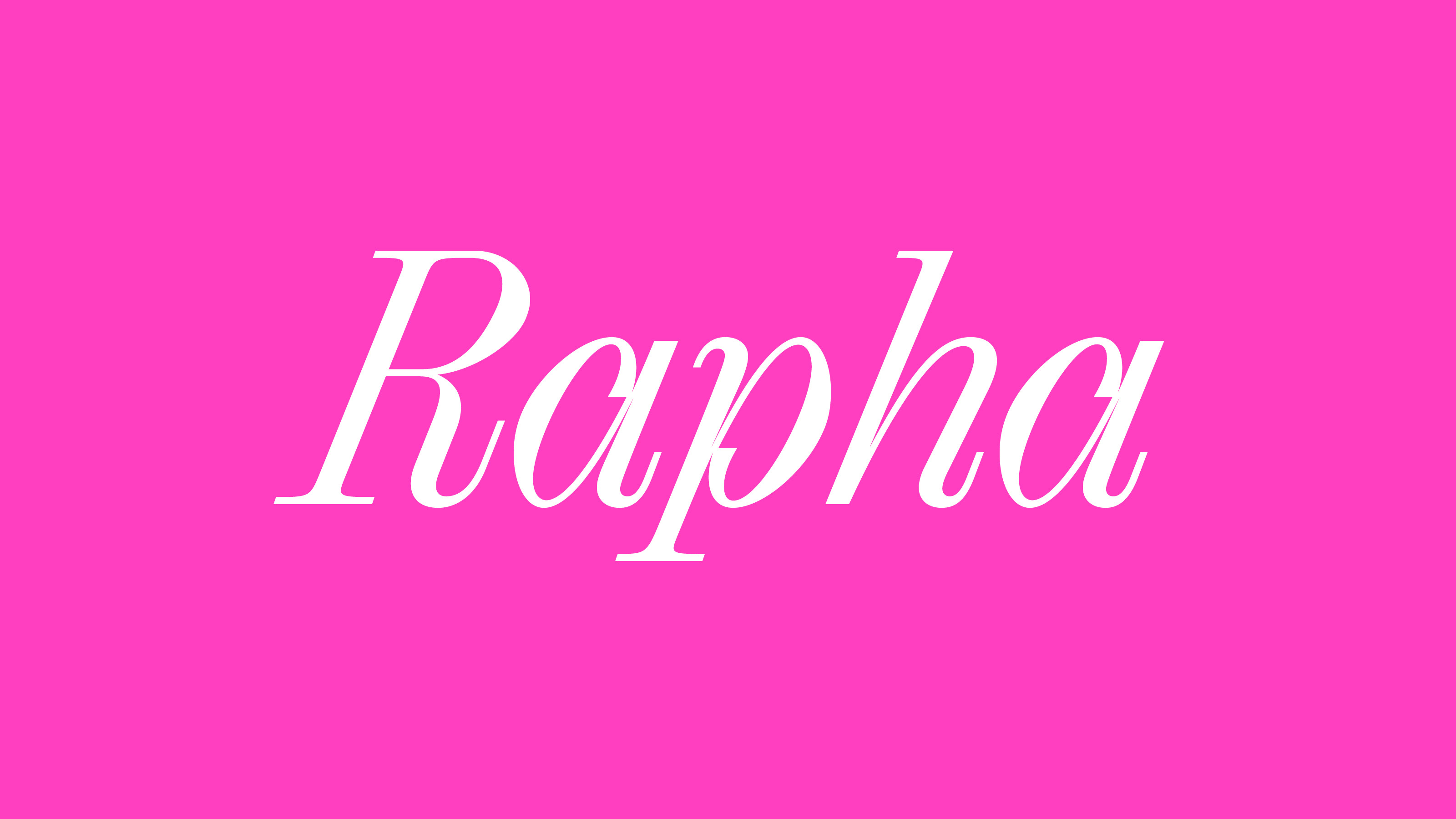
Since 2013 I have redrawn the letters several times, but I’ve found it’s clear voice only 5 years after the first sketches. In 2018 I redesigned all the characters with more geometric details and a comletely new italic style. The horizontal part of the 2, and 7, the vertical tails of the a, t, R show the clear geometric attitude. Amen Display has 6 weights in Roman and Italic styles. The cursive lowercase letters are true italics, the construction of the shapes follow the movement of a writing hand. The rounded characters (a,b,d,p,q) have a special inbound, to reflect to the structure of a handwritten letter.
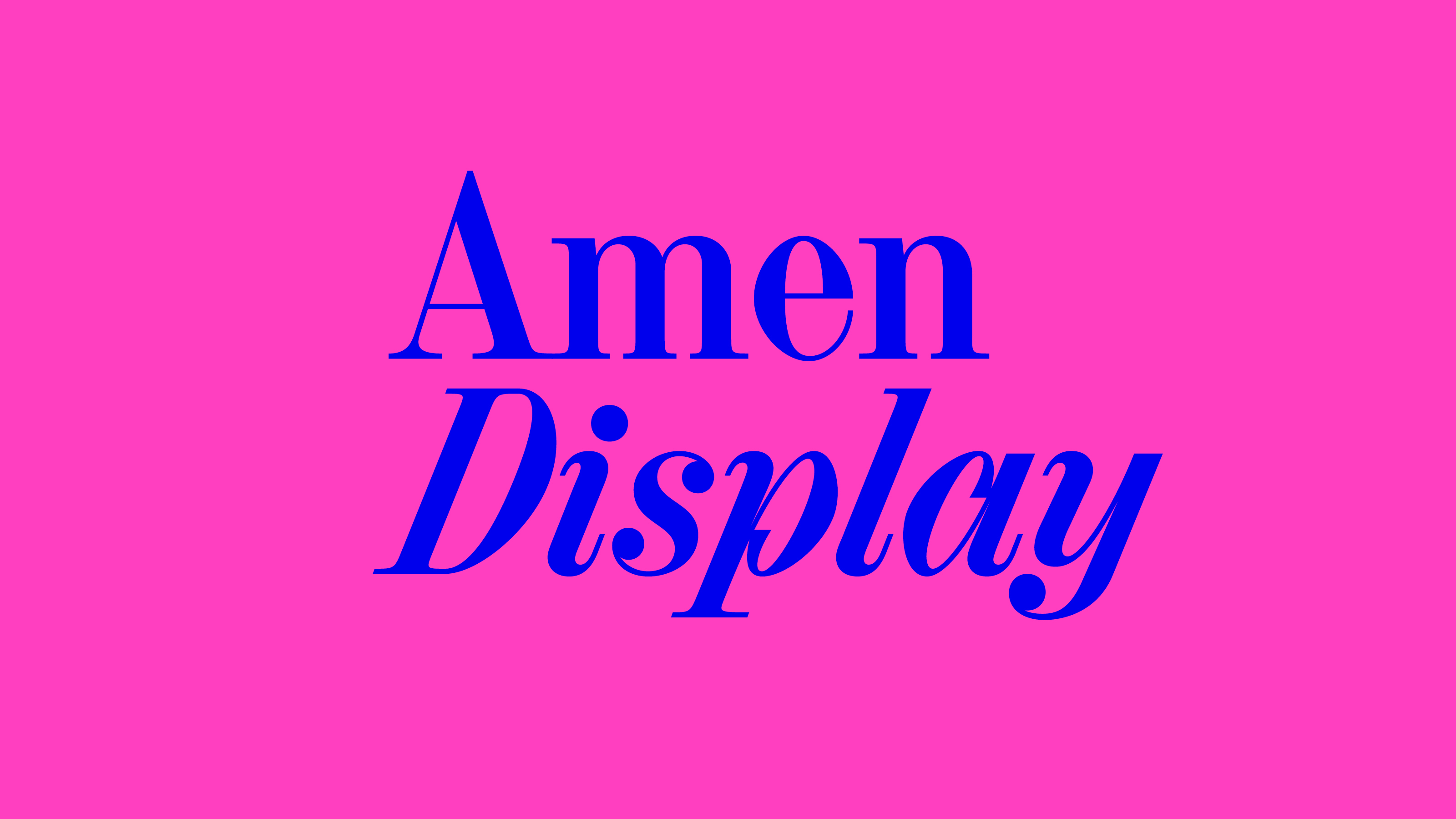
The height of the serifs are always the same between the different weights. The typeface works best in large sizes, the smallest recommended point size is 24 pt. Later I’m planning to expand the family with text optical size.
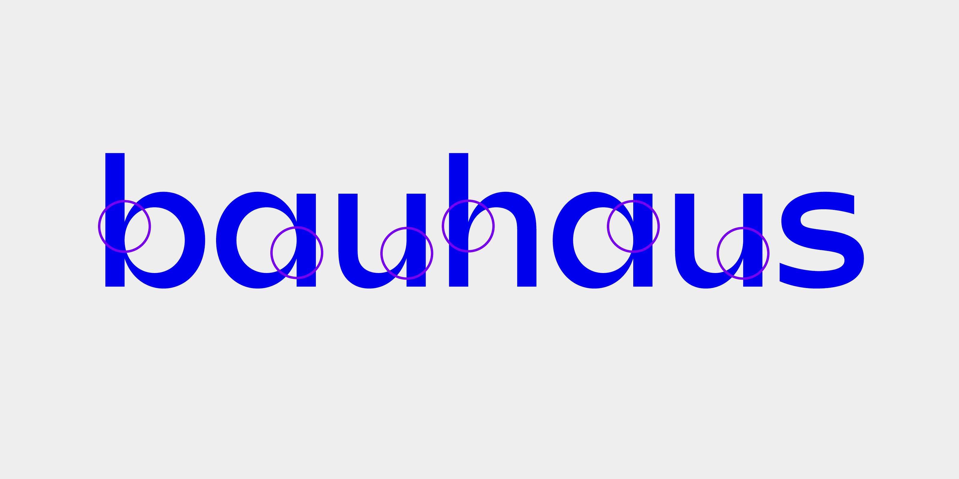
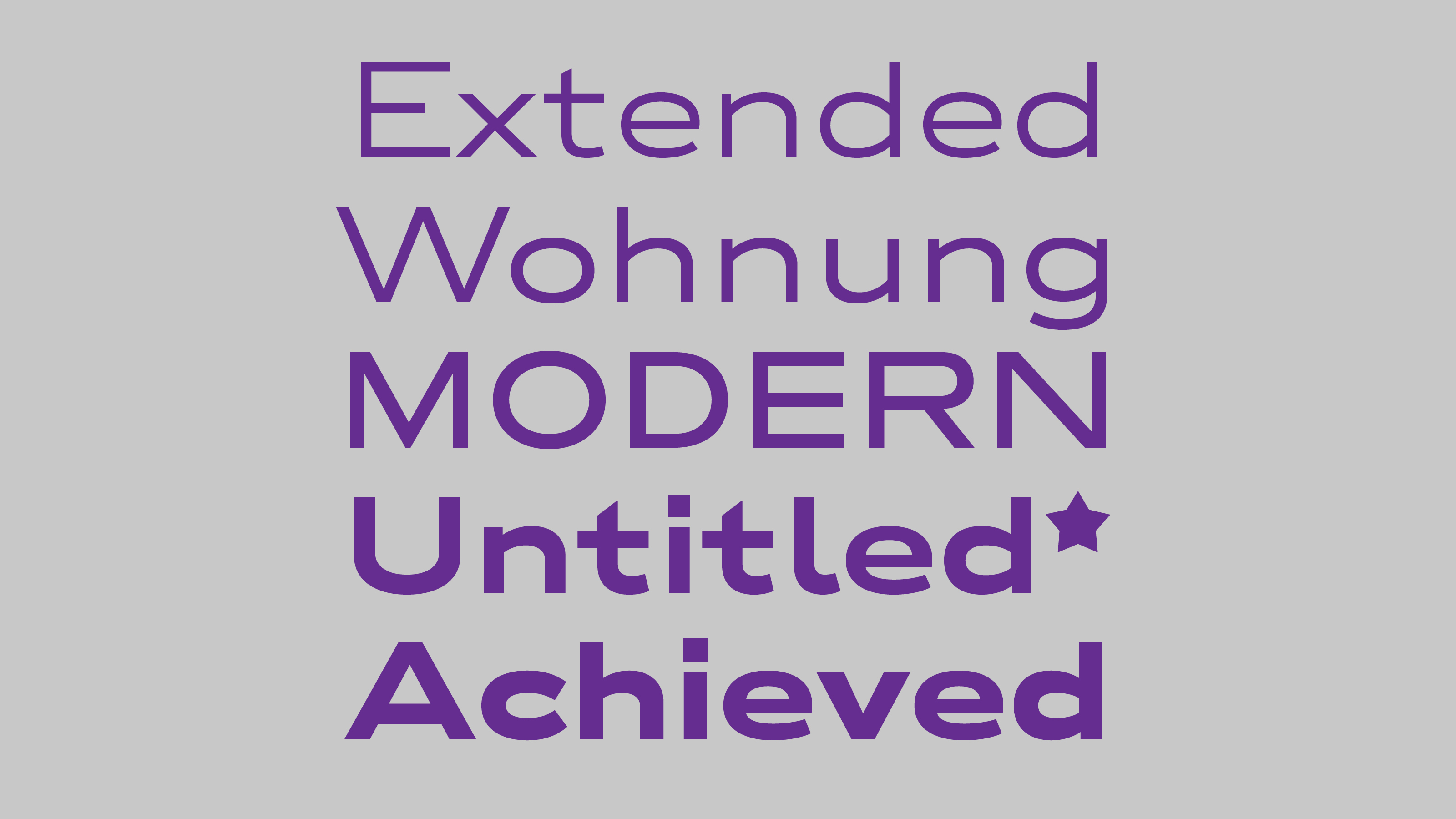
Laslo 2016 – 2018
The Bauhaus Archive in Berlin is one of my favourite places. I like drinking there a coffee, and sketching ideas on the terrace, while thinking on what does ‘functional’ mean. After the first TypoLabs conference I visited again the museum, with a lot of ideas after those inspirational days. On the exhibition there was a Tapetenmusterbuch (facing paper specimen) from the early 1930’s. I fell in love immediately with the letter ‘a’ on the cover and wanted to redraw it and adapt to my language.
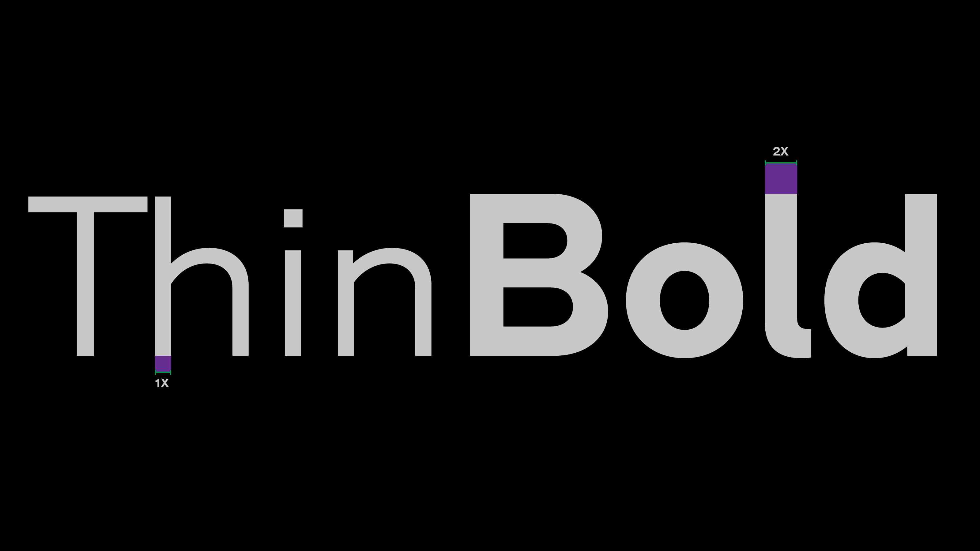
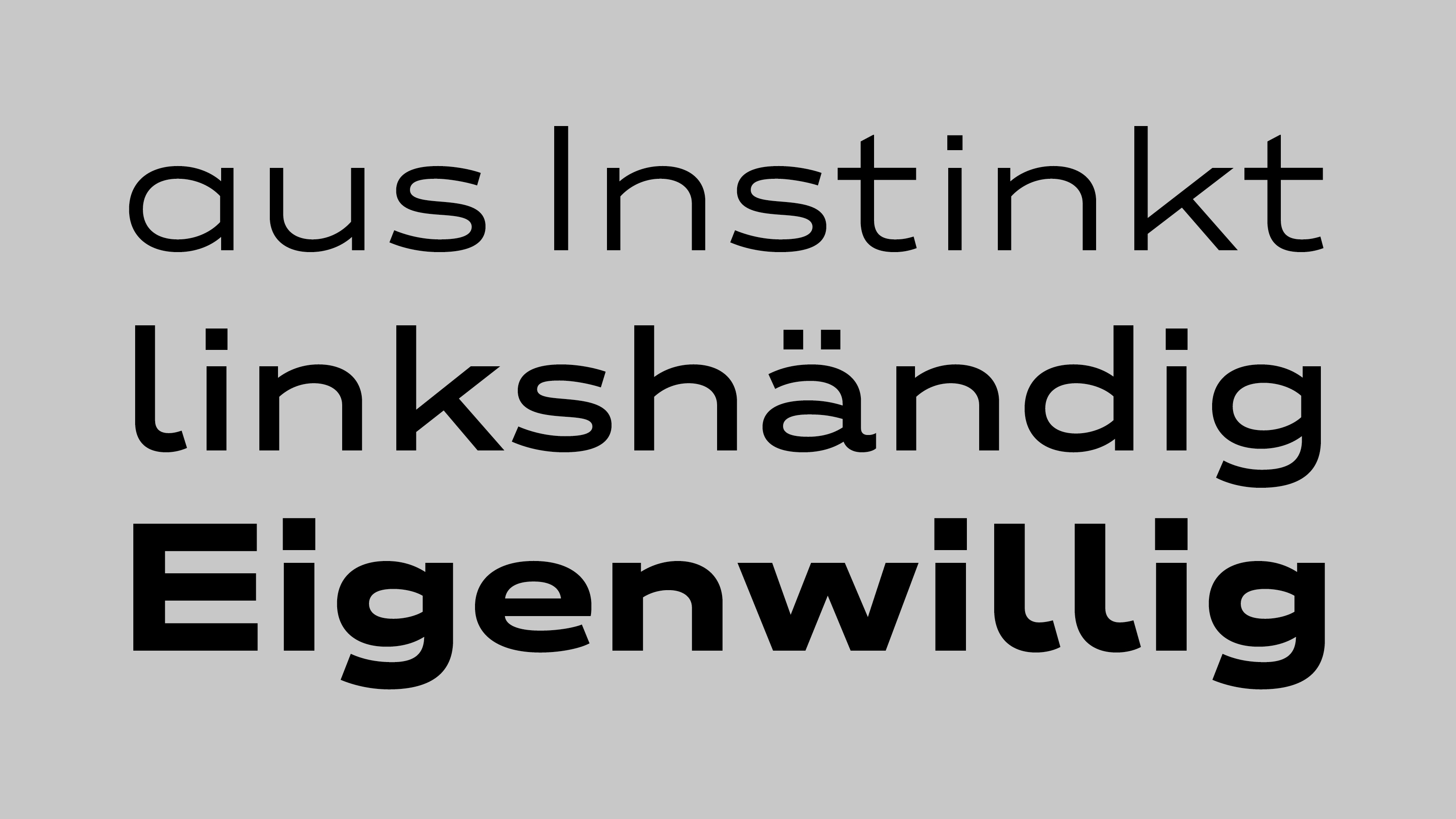
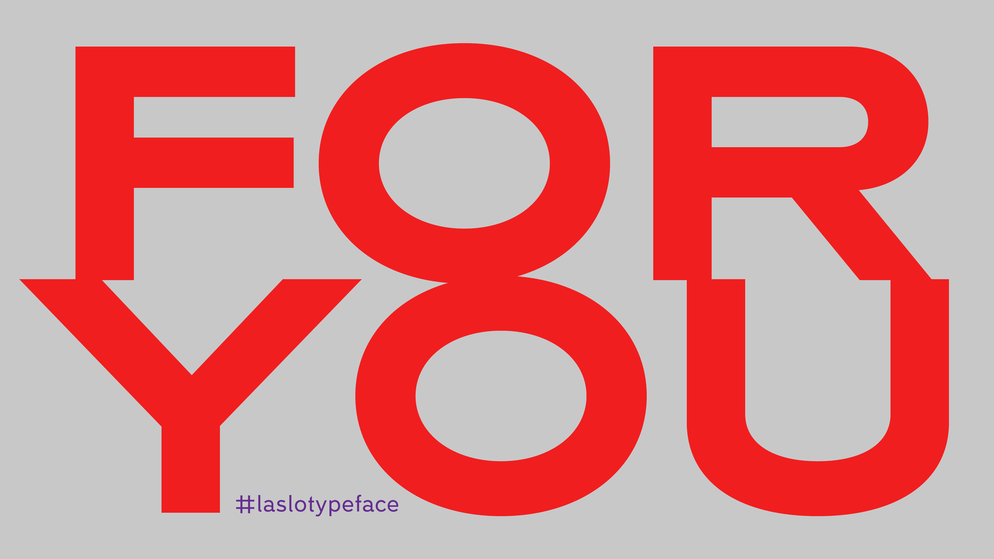
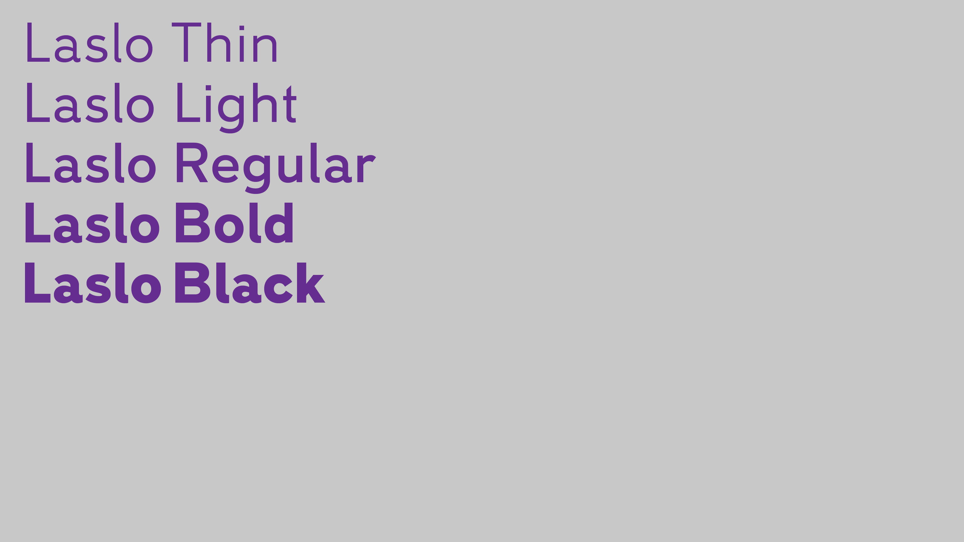
From this letter I created the whole alphabet (usually I start with an ‘n’ and a ‘p’ character). The letters are clean, but they have a small unusual feature: the countershapes of the rounded letters (b, d, g, p, q) have a small vertical straight part, which is large enough to be visible in bigger point size, but small enough to create a rounded form in smaller sizes. To help the constructed, grid-based graphic design the Thin lowercase stems are 50% of the Bold stems, you find the same proportion between the Light and Black characters too.
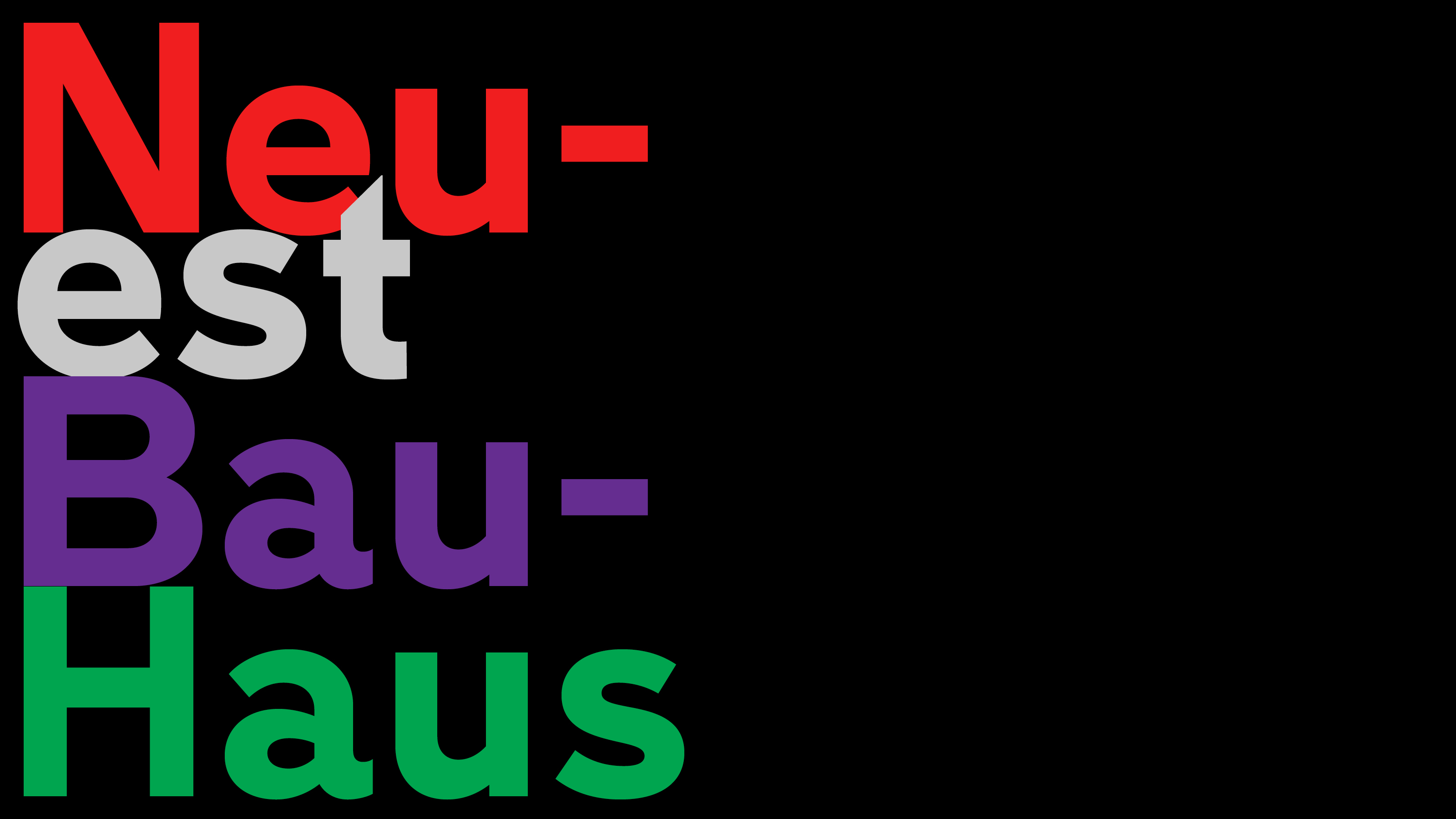
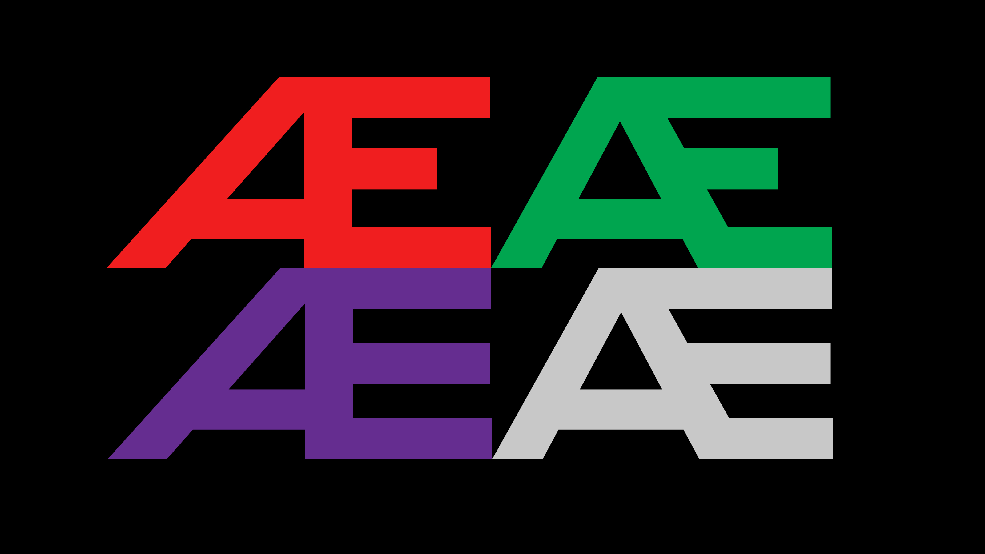
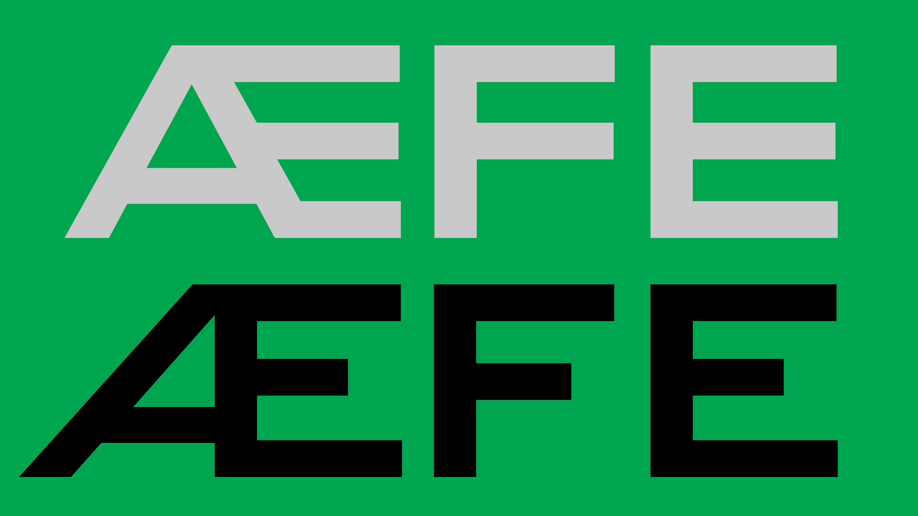
The typeface contains alternate characters for a more geometric style, like the single-storey ‘a’ or the ‘E, F’ with optically same arm length and the simpler 4 and 7 figures. The typeface has 5 widths from Thin to Black in two weights: Normal and Wide. The wide styles are easy to combine with the regular ones, perfect to highlight information, or for an eye-catching typography. All the letters reflect to the heritage of the Bauhaus, they are clean and concrete. I made all the characters as functional as possible.
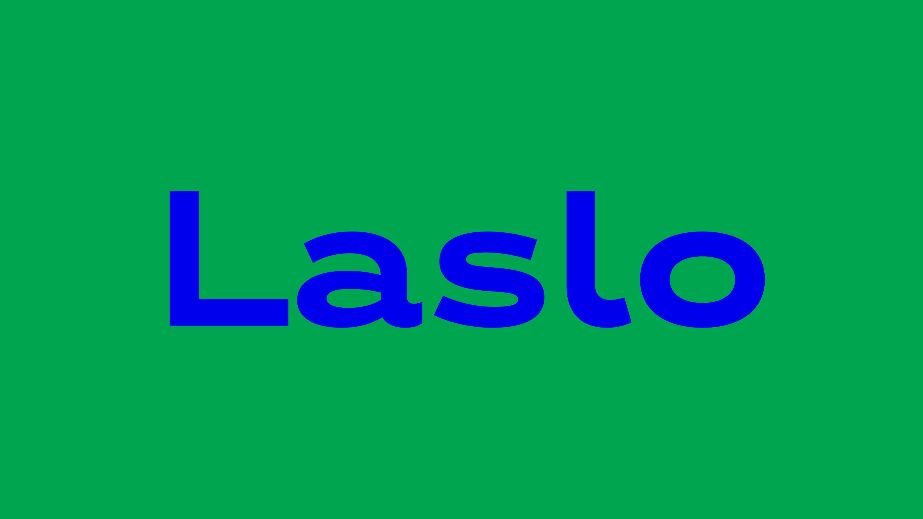
Laslo was named after the most famous Hungarian designer from the Bauhaus: László Moholy-Nagy, and was released on his 123rd birthday. Happy birthday László, I hope, you would like it!